Designing a Calmer Mental Health Experience for Neurodivergent Users.
An end-to-end product design case study focused on reducing friction, increasing clarity, and celebrating meaningful progress.
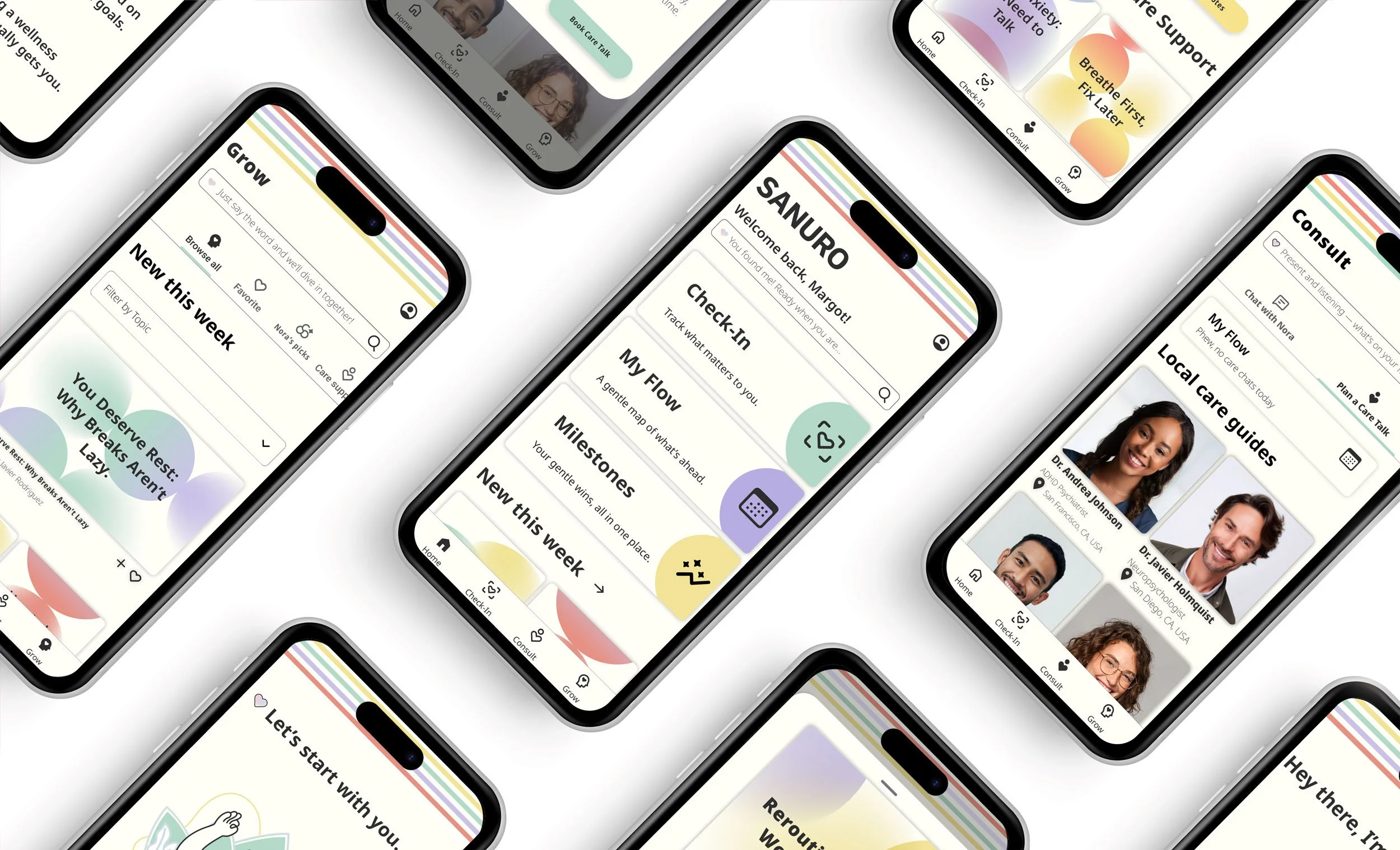
For many neurodivergent individuals, wellness can feel overwhelming — scattered resources, complex apps, and support that often feels impersonal. I created SANURO, a calming mental health and wellness app designed specifically for neurodivergent users.
My user research revealed three core needs:
Meaningful health tracking
Curated content tailored to neurodivergent patterns
A progress board to celebrate milestones
At the center is Nora, a friendly AI health assistant who guides users like a trusted best friend. For subscribers, SANURO offers additional benefits, including expert appointments, downloadable content, and deeper personalization. Free users can unlock these premium features for a limited time simply by making progress in the app, ensuring encouragement is built into the experience. Care Guides also have tools to share content, review patient histories, and provide more comprehensive support.
At its heart, SANURO is built on one belief: seeking help should never feel like another obstacle — it should feel safe, supportive, and uncomplicated.
Project Overview
SANURO is an end-to-end product design case study developed during my Product Development course at CareerFoundry.
Role
Product Designer
Project Type
UX/ UI Case Study
Duration
May - December 2025
Tools
Pen and Paper, Figma, Figjam, Miro, Adobe Creative Suite, ChatGPT
Problem Statement
Neurodivergent individuals need a mental wellness experience that reduces cognitive overload, adapts to their patterns, and makes progress feel visible, so seeking support feels empowering rather than exhausting.
I will know this is true when I see increased daily and weekly check-ins, higher milestone completion rates, and improved retention from free to premium.
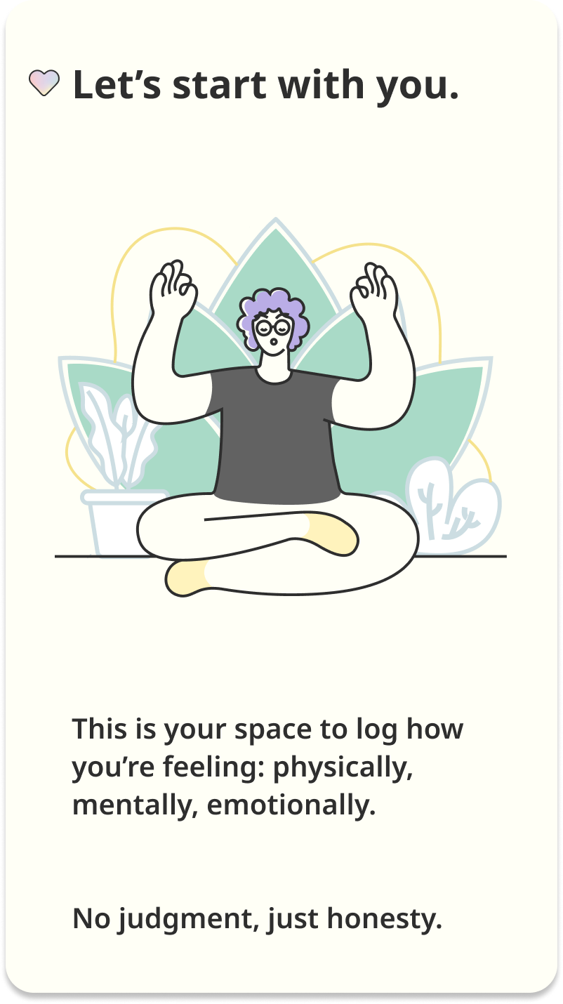
A calm, low-friction introduction designed to reduce overwhelm and invite honest reflection.
User Research Snapshot
Grounding the problem in real user needs and behavioral patterns.
Research Approach
Who
3 neurodivergent participants (ages 18–44)
Why
Participants represented different neurotypes, helping surface how needs, sensitivities, and support preferences vary across neurodivergent users.
Process
I conducted interviews, then synthesized findings through individual empathy maps and an affinity map to identify recurring patterns across participants.
Key Insights
Across interviews, three themes consistently emerged:
Overwhelm from information overload: Users felt discouraged by feature-heavy experiences, excessive notifications, and unclear pricing.
A need for calm, control, and relevance: Participants wanted simple tools that adapt to their goals and energy levels—without forcing rigid routines.
Emotional support matters: Users valued encouragement and non-clinical language, alongside accessible education and gentle motivation that supports mental well-being.
These insights informed the primary personas and guided SANURO’s focus on clarity, choice, and compassionate support.
“When an app has too many options, I shut down. I just want something simple that works.”
Information Architecture
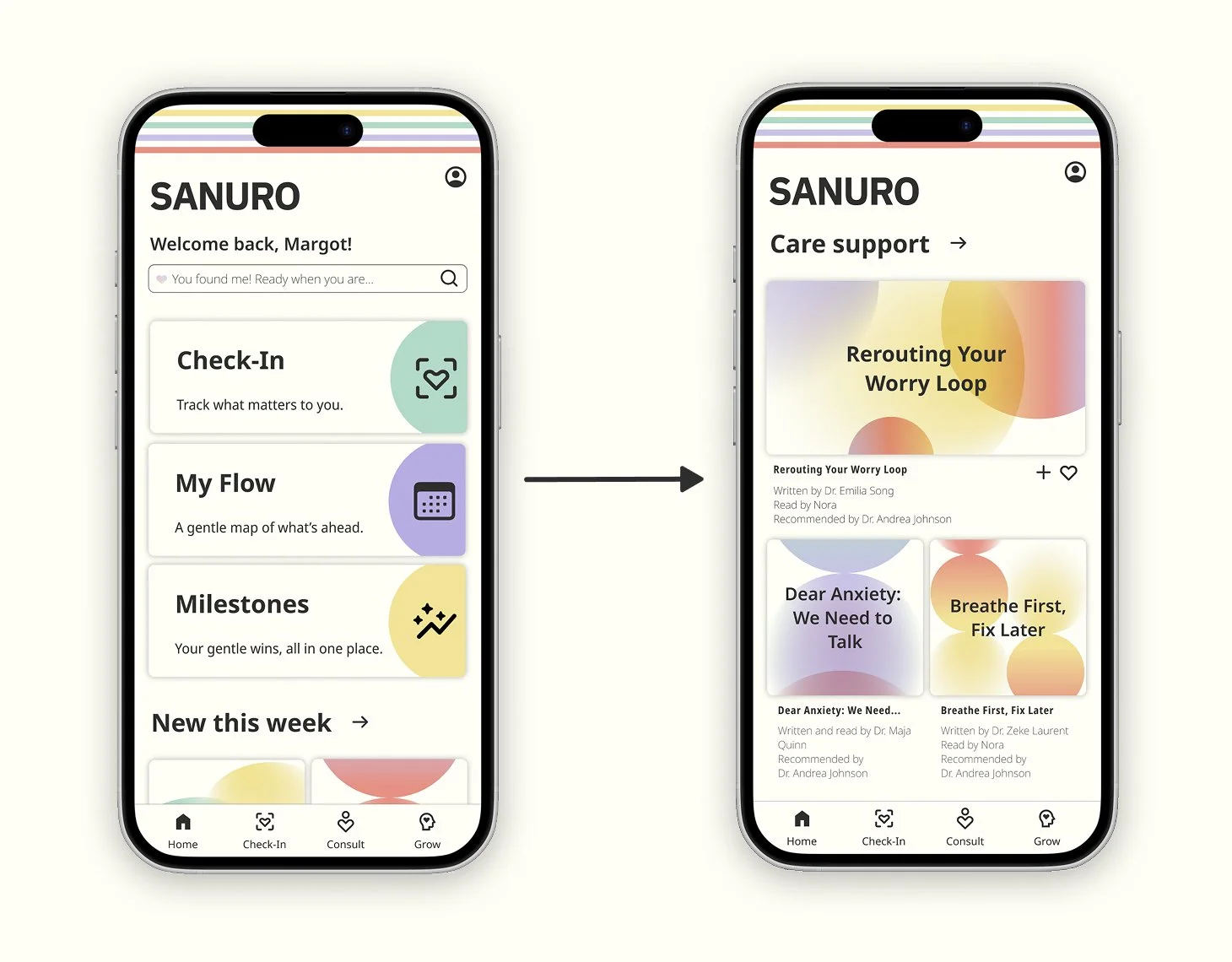
After creating SANURO’s sitemap, I refined it using a user card-sorting exercise. The findings showed how participants naturally grouped features, allowing me to shift from a feature-based layout to more intuitive, task-oriented navigation.
Key updates
Unified tracker tools under a single Check-In section
Combined chat and expert consultations into Consult
Added a dedicated Learn section for media and educational content
Impact
The revised architecture improved clarity between profile and account settings, simplified appointment flows, and supported more seamless navigation throughout the app.
Key Design Decisions
Calm Interaction Model
Because users may feel overwhelmed by a variety of triggers, the interface prioritizes a calm visual hierarchy and simplified navigation.
Focused Navigation Structure
To reduce cognitive load, the app centers on three primary areas: check-ins, consulting with care guides, and using media as a wellness tool.
Accessible Interaction Patterns
Predictable interaction patterns help users build habits without introducing unnecessary friction.
Primary Personas
To ground the problem in real needs, I translated research patterns into primary personas — capturing the behaviors, sensitivities, and support preferences SANURO must design for.
Core User Flows
Successfully integrating AI into my workflow to make better design decisions and presenting stronger work in my job search.
Flow 1: Log Health Data
User Story
As a newly diagnosed neurodivergent, I want to log and track my mood so that I have a better understanding of myself.
Reasoning Behind the Flows
After logging in to the app, I wanted to give the user different ways to log their health data. I knew I wanted to give them the option to log their data from the home screen, and also allow them to use the same approach through the Check-In page.
Flow 2: Scheduling an Appointment
User Story
As a mindful adult, I want to schedule a chat with a health expert so I can ask questions and gain insight into my health without feeling judged.
Reasoning Behind the Flows
Since this is a subscription feature, I wanted to separate the flow from the home page, so I want to concentrate it on the Expert page and Calendar Dashboard.
Flow 3: Accessing Media
User Story
As a curious neurodivergent user, I want to access health content to learn how to better care of myself.
Reasoning Behind the Flows
I wanted to present users with a few ways to access health content- through the home page and also the media page, to allow for easy access.
Low-Fidelity
Beginning with low-fidelity sketches helped me experiment freely, clarify the user journey, and shape the app’s fundamental structure.
-
After analyzing patterns across different neurotypes, I focused the health-tracking experience on one principle: make logging feel simple, fast, and low-effort. To minimize steps and prevent navigation overload, I used modals as the primary interaction pattern—allowing users to enter health data and view history without leaving their current context.
Building on the Check-In modal, I added a tracker drop-down so users can switch between trackers in one place rather than returning to the main Check-In screen—keeping the flow focused and reducing friction.
-
After establishing the Home and Check-In patterns, I sketched the Consult flow and booking experience with one goal: make finding support feel simple, familiar, and low-friction.
For the Consult page, I mirrored the Home layout to maintain consistency and reduce cognitive load—while prioritizing the expert’s photo, credentials, and key details at a glance.
For booking, I streamlined the flow by pre-filling account information (e.g., name, age, birth date, neurotype) so users only complete what’s essential:
Expert availability
Reason for the appointment
Communication style
-
While sketching the AI filter for the Learn experience, I aimed to make content discovery feel familiar, calm, and easy to control. I carried the same layout logic from desktop into mobile to maintain consistency and reduce relearning across devices.
To keep the filter intuitive, I designed it to behave like a standard content filter—while also supporting a search-first fallback when a user’s needs aren’t represented by the preset options. This ensures users can quickly narrow content without feeling limited or overwhelmed.
Flow 1: Log Health Data
Check-In Modal
Initial concepts focused on making check-ins feel simple and low-pressure. The refined wireframe uses a modal-based flow to minimize navigation and keep reflection contained and approachable.
Flow 2: Scheduling an Appointment
Appointment Card
To make scheduling feel less overwhelming, I explored ways to simplify expert selection and booking. The refined wireframe prioritizes clear availability, minimal input fields, and a contained scheduling flow to reduce decision fatigue.
Flow 3: Accessing Media
Media Menu
Content discovery needed structure without adding noise. The refined wireframe introduces a focused filter menu that surfaces relevant media while keeping exploration clear and manageable.
Mid-Fidelity
At this stage, I translated my low-fidelity concepts into a more structured layout using a 12-column mobile grid.
I refined spacing, alignment, and hierarchy to create clearer entry points—so each screen feels calmer, easier to scan, and less visually overwhelming.
Flow 1: Log Health Data
Check-In Modal
Mid-fidelity refinement focused on clarity and calm. I tightened spacing and hierarchy within a modal-based check-in so reflection stays contained, low-pressure, and easy to complete in one focused moment.
Flow 2: Scheduling an Appointment
Appointment Card
To reduce decision fatigue, I refined the appointment screen layout with clearer grouping and more breathing room—highlighting availability first, minimizing inputs, and keeping the scheduling path straightforward and contained.
Flow 3: Accessing Media
Media Menu
I streamlined content discovery by refining the filter menu’s structure and scanability. Improved spacing and visual grouping helps users find relevant media quickly—without adding noise to the browsing experience.
Accessibility Considerations
Because SANURO supports neuro-inclusive wellness tracking, accessibility, and cognitive clarity were my core design priorities.
• Tested color contrast to meet WCAG 2.1 readability standards
• Reduced cognitive load through simplified navigation and calm visual hierarchy
• Used clear typography and spacing to improve readability
• Designed interaction patterns that minimize overwhelm and support focus
High-Fidelity
I refined Sanuro’s core journeys while bringing the brand’s visual identity to life.
With the color palette, design language, and component system established, I shaped the final mobile experience across three essential flows.
Flow 1: Log Health Data
Check-In Modal
A calmer, modal-based check-in that keeps reflection contained and minimizes cognitive load.
-
I refined the health-logging flow to feel clearer and more approachable. I improved structure, spacing, and hierarchy so users can log data confidently—without extra steps or visual overwhelm.
Flow 2: Scheduling an Appointment
Appointment Modal
A streamlined scheduling experience that reduces decision fatigue through clearer grouping and a more contained booking flow.
-
While evaluating the mid-fidelity wireframes, I noticed scheduling required more navigation than intended for a calm experience. Reusing the established modal pattern to reduce navigation, consolidate key actions, and make booking feel more intuitive and lower-effort.
Flow 3: Accessing Media
Media Menu
A focused, filter-driven media experience that improves discoverability while keeping exploration clear and manageable.
-
I refined the media experience and changed the name from “Learn” to “Grow” to better reflect Sanuro’s brand ethos. I tightened the AI filter and content structure so discovery feels supportive and empowering, more personal growth than instruction.
Usability Testing
The goal of this usability study was to assess how easily users could learn and navigate the prototype.
By observing participants as they interacted with the app’s key features, I gained insight into their behaviors, expectations, and areas where the design could be strengthened.
Test Objectives
Main Objective
Assess navigation efficiency across the app’s primary features: logging health data, booking an appointment, and filtering content.
Logging Health Data
Evaluate how easily participants can locate the health-logging feature.
Booking an Appointment
Measure how intuitive the scheduling flow is when using modals.
AI Content Filter
Identify any confusion between general content filters and AI-filtered content.
-
Depending on each participant’s location, the usability study was conducted either in person (at the participant’s residence) or remotely for those outside the Los Angeles area.
This flexible format supported SANURO’s goal of meeting neurodivergent users where they are—creating a more accessible, low-pressure testing experience while still capturing consistent feedback across sessions.
-
After each session, I consolidated my notes, reviewed key moments from the recordings, and translated observations into a Usability Test Affinity Map. This helped me cluster similar comments, behaviors, and pain points encountered while participants moved through the prototype.
From there, I documented patterns in a Rainbow Spreadsheet to surface repeat issues, compare severity, and prioritize what to address. This process revealed five recurring usability challenges that became the focus for the next round of design improvements.
Issue 1
AI Filter Placement Was Easy to Miss
Insight
AI filter was hidden in the drawer menu, making it difficult for most users to locate the filter options.
Update
Reformatted the Grow page so the AI filter appears at the top.
Expected Outcome
Users will find Care Support recommendations more easily due to consistent UI components used throughout the design.
Issue 2
Expert Recommendations Lacked a Clear Entry Point
Insight
4 out of 5 users first navigated to Home to find ‘Expert Recommendations’
Update
Added an ‘Expert Recommendations’ section on Home (below 'For You’) and surfaced it in the calendar dashboard, ‘My Flow’.
Expected Outcome
Users will find ‘Expert Recommendations’ faster from Home and ‘My Flow’, with fewer detours and taps.
Issue 3
Scheduling Flow Required Too Much Navigation
Insight
Most participants tapped “My Flow” expecting to schedule an appointment with an expert.
Update
Enhanced the calendar dashboard to direct users to the ‘Expert’ tab and support quick rebooking with prior experts.
Expected Outcome
Users will schedule (and rebook) in fewer steps because appointments, past sessions, and related care content live in one predictable place.
Issue 4
Dashboard Labels Didn’t Match User Expectations
Insight
Dashboard naming was unclear—most participants tapped ‘Little Wins’ to log health data.
Update
Renamed and clarified ‘Little Wins’ and repositioned the progress dashboard on Home to better match user expectations.
Expected Outcome
Users will find health tracking more quickly and make fewer incorrect taps when labels and placement align with the feature’s purpose.
Issue 5
Bottom Navigation Selected State Lacked Contrast
Insight
Pastel-selected states reduced legibility in the bottom navigation.
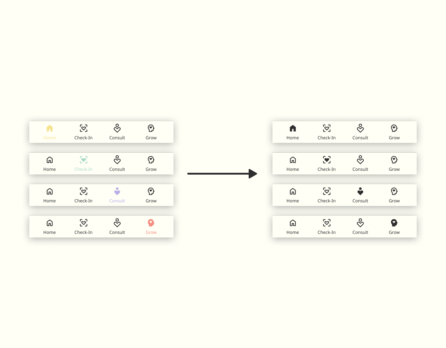
Update
Updated the bottom navigation icons and text so selected states use high-contrast black instead of varied colors.
Expected Outcome
Users will navigate more confidently with fewer hesitation moments because selected states are clearer at a glance.
Outcome of Usability Improvements
Following usability testing, several structural improvements were introduced to improve navigation clarity and reduce cognitive load.
Key improvements
• Relocating the AI filter to improve content discovery
• Introducing expert recommendations within familiar UI patterns
• Clarifying navigation through improved bottom-menu contrast
• Aligning core features with consistent modal interactions
These refinements helped create a calmer and more predictable experience across Sanuro’s primary flows.
Product Demo
This product walkthrough reflects what Sanuro aims to bring into users’ lives: calm, clarity, and gentle support.
As you explore the core features, you’ll notice how each interaction is thoughtfully crafted to keep things simple, create a consistent experience, and help users feel grounded.
Design System
While refining the prototype, I clarified the design principles SANURO needed to deliver: consistency, emotional safety, and intuitive pathways.
Because clinical interfaces can feel cold or dismissive, SANURO avoids overly medical language and sharp visual cues. Instead, the system uses soft structure, friendly copy, and predictable patterns to help users feel supported, understood, and in control.
Logo
A simple wordmark that keeps the brand clear, calm, and instantly readable.
Typography
A clean, accessible type scale built with Noto Sans to ensure clarity across neurodiverse users.
Color
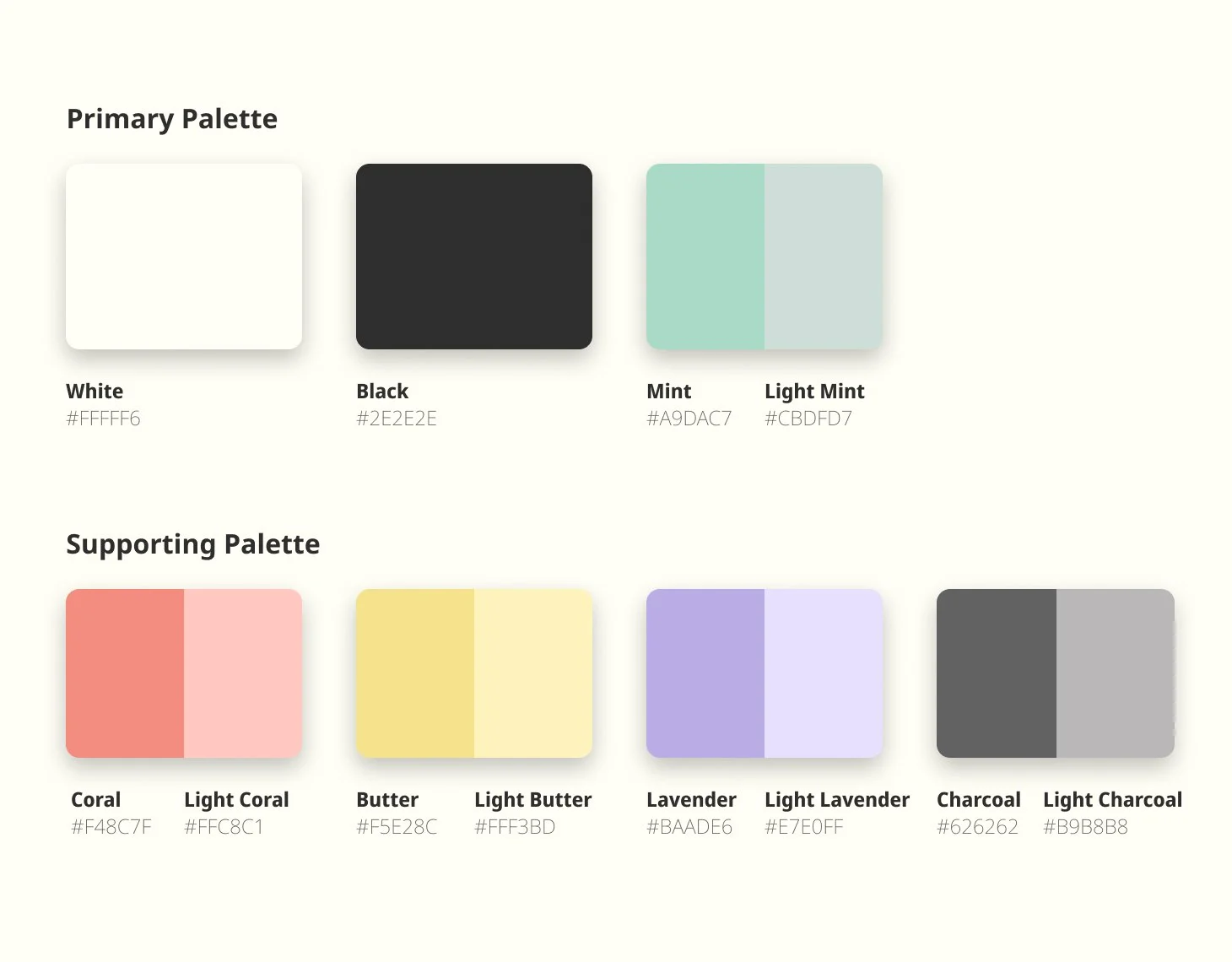
A soft palette of pastels that creates a calm, supportive atmosphere and reduces visual stress.
Accessibility
All color combinations were tested to meet WCAG 2.1 AA accessibility standards.
Imagery
A cohesive visual language, calming illustrations, approachable profile imagery, and soft gradient artwork, to reinforce a supportive, welcoming tone.
Iconography
Rounded, consistent icon strokes that maintain a friendly tone and improve scannability across the UI.
UI Components
Modular components built for low-friction navigation, predictable patterns, and structured health tracking.
Full Style Guide
For a deeper look at the complete design system and component library, view the full style guide presentation created for this case study.
Reflection
Over the course of the project, SANURO evolved through a steady loop of feedback, prototyping, and hands-on testing.
In the early low- to mid-fidelity stages, I experimented with a few nonstandard UI elements. While visually interesting, they competed with the calm, reassuring tone I wanted to build—and risked adding cognitive effort in moments that should feel simple and grounding. With guidance from my tutor and mentor, I refined the visual language. I shifted toward familiar, predictable patterns in the high-fidelity designs to make the experience feel more intuitive, soothing, and easy to navigate.
User testing played a major role in shaping the final prototype. Watching participants move through key flows helped me pinpoint where navigation felt unclear and where extra steps created unnecessary friction. Those observations led to streamlined interactions, added supporting flows, and targeted accessibility improvements that strengthened clarity without sacrificing warmth. Peer feedback further helped me polish both the UI details and the overall product experience.
Ultimately, SANURO’s iterations reinforced a core lesson: staying open to feedback isn’t just helpful—it’s essential. Each round of refinement brought the product closer to its purpose, making it more usable, more functional, and more aligned with a neuro-inclusive, low-friction approach to wellness.
Improvement Plans
There are a few high-impact areas I would prioritize in the next iteration of the SANURO prototype.
First, I’d strengthen onboarding by introducing a guided walkthrough immediately after sign-up—helping new users understand the core features and how to get value from the app right away. I would also make these walkthroughs available in the Account section so users can revisit them at any time, at their own pace.
Next, I’d expand the Milestones feature by connecting it directly to the user’s profile. This would create a single, easy-to-scan hub that highlights achievements, progress over time, and account status—clearly differentiating between freemium and subscribed experiences while reinforcing motivation and continuity.
I’m confident these improvements would help SANURO feel even more supportive and calming—while deepening engagement through clearer guidance, stronger progression, and a more connected account experience.