Curate
AI fitness for the life you actually have.
UX/ UI + AI Case Study · Concept Project · AI-Augmented Workflow · Role: Product Designer
OVERVIEW
Curate is a concept fitness app designed for people who've tried fitness apps and left. Not because they lacked motivation, but other fitness apps made them feel watched and behind. The product is built around three pillars: zero-decision onboarding, shame-free progress tracking, and a warm AI coach that adapts to real life — not to an ideal schedule.
This case study documents the full design process — from competitive research and persona development through brand identity, UX strategy, and onboarding prototype — with AI embedded as a strategic thinking partner across every phase.
ROLES + RESPONSIBILITIES
ROLE
DURATION
RESPONSIBILITIES
BREAKPOINT
TOOLS
Product Designer
4 Weeks
Competitive Analysis · Persona Development · Customer Journey Mapping · Brand Identity · Voice & Microcopy · UX Strategy · Interaction Design · AI Collaboration
Mobile
Figma · Claude · ChatGPT · Perplexity · Consensus · Stitch · Gemini · Gamma
THE PROBLEM
The fitness app market has a design problem, not a motivation problem.
Streak counters, declining progress charts, and guilt-driven re-engagement notifications all send the same message: missing a day is failure. 22.9% of people who download a health app stop using it — and shame-driven dropout is a documented reason why. The competitors know retention is broken. They keep building the same architecture anyway.
The gap in the market wasn't a missing feature. It was a missing philosophy — one that treats irregular weeks as normal user behavior, not as something to correct.
MY APPROACH
One insight. 4 weeks. Every decision traced back to it.
Before any design work began, four principles shaped the foundation:
Fitness apps fail at retention because they're designed for consistency they can't guarantee.
Shame is a documented dropout driver, not a motivator.
AI should reduce decisions, not add them.
A brand built for this positioning has to earn trust at the word level — not just the visual level.
These weren't conclusions I arrived at. They were the lens I designed through. AI was embedded from the first research session — not to generate answers, but to pressure-test assumptions and accelerate synthesis so more time could go toward the decisions that required judgment.
RESEARCH
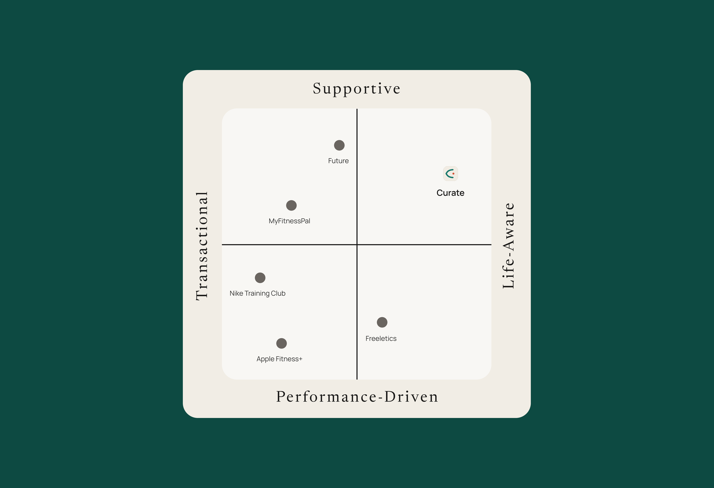
One empty quadrant. Every competitor missed it.
A competitive analysis across five major incumbents — Nike Training Club, Apple Fitness+, Freeletics, MyFitnessPal, and Future — revealed a consistent pattern: every app clusters in the performance-driven, transactional quadrant. Supportive and life-aware was wide open.
The research also surfaced a structural insight about why incumbents stay where they are. Performance metrics are easier to design for. Shame-free progress architecture requires the product to hold a different belief about users — and most products aren't built to hold beliefs.
INSIGHTS
01
Onboarding complexity is the primary dropout driver for first-time users — not lack of motivation.
02
Progress framing that treats variability as failure compounds dropout rather than preventing it.
03
AI coaching optimized for performance metrics fails the users who need an adaptive coach most — the ones whose capacity varies day to day.
USER PERSONAS
Six personas. One primary lens.
The research produced six distinct personas spanning the core user segments — from first-time fitness app users navigating decision paralysis to experienced users who've abandoned multiple platforms for reasons that never made it into the app's analytics.
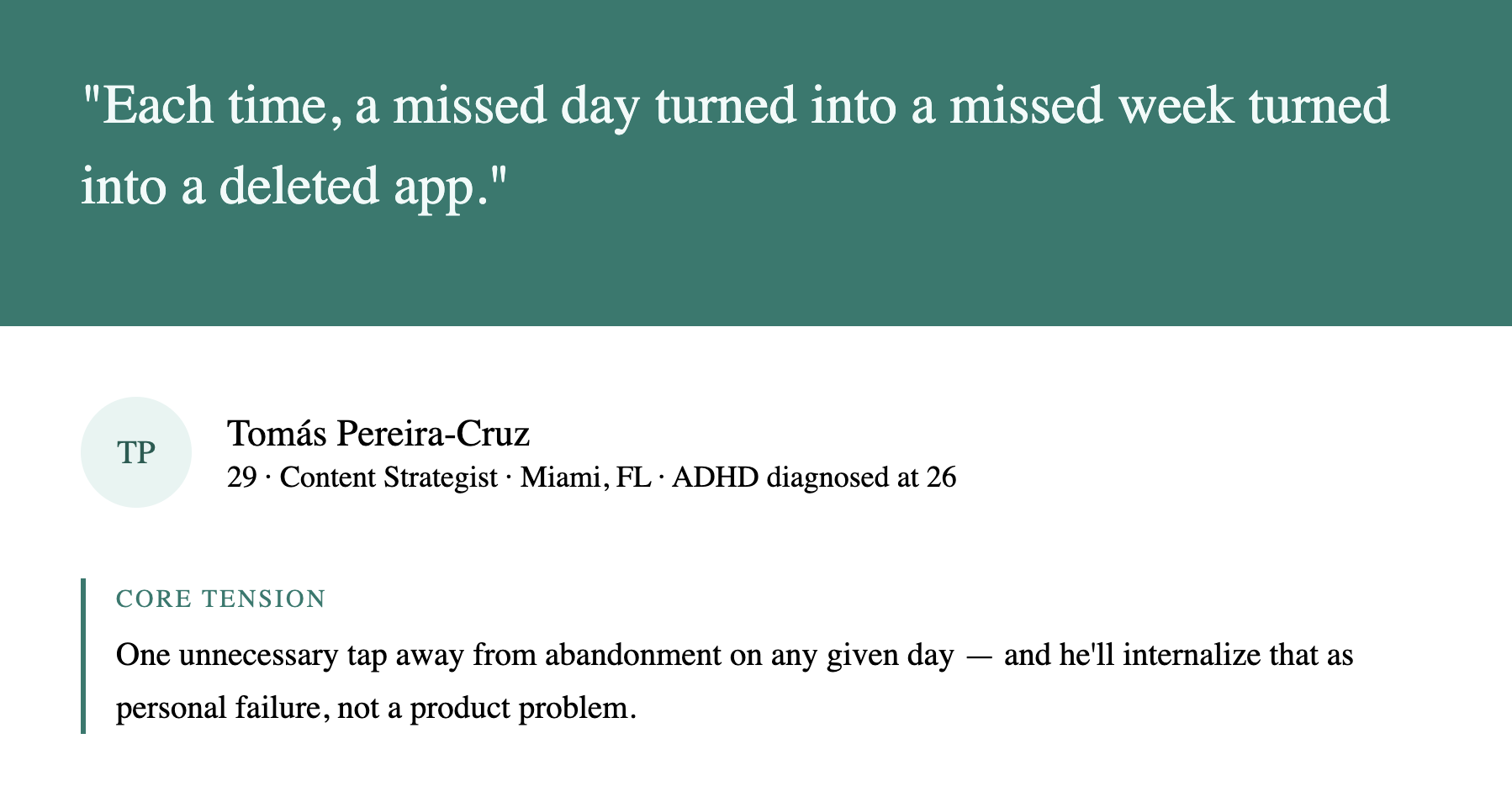
Tomás Pereira-Cruz became the primary generative persona. 29, content strategist, Miami. Recently diagnosed with ADHD. Has abandoned four fitness apps in two years — not because he stopped wanting to move, but because each one eventually made him feel watched and behind. Every design decision was filtered through one question: would this work for Tomás on a Tuesday night when his energy is low, and his patience is lower?
UX JOURNEY + OPPORTUNITIES
Mapping Tomás's journey across five stages — Awareness, Consideration, Onboarding, Core Use, and Retention — identified where existing products lose users and why. Three opportunities emerged, each tied to a specific moment of failure.
Three opportunities. Each one a failure mode no competitor had fixed.
01
Zero-Decision Onboarding
Reduce the path from download to first session to under 90 seconds and one decision. The AI learns from the first movement — not from a form.
02
Shame-Free Progress
Replace streak counters and declining charts with a progress model that treats an irregular week as data, not defeat.
03
Warm Coach AI
Every competitor optimizes AI for performance metrics. Curate's AI is optimized for how you feel at 9 pm on a Tuesday — adapting session intensity to real life, not to a schedule.
BRAND + IDENTITY
A brand built from the positioning up.
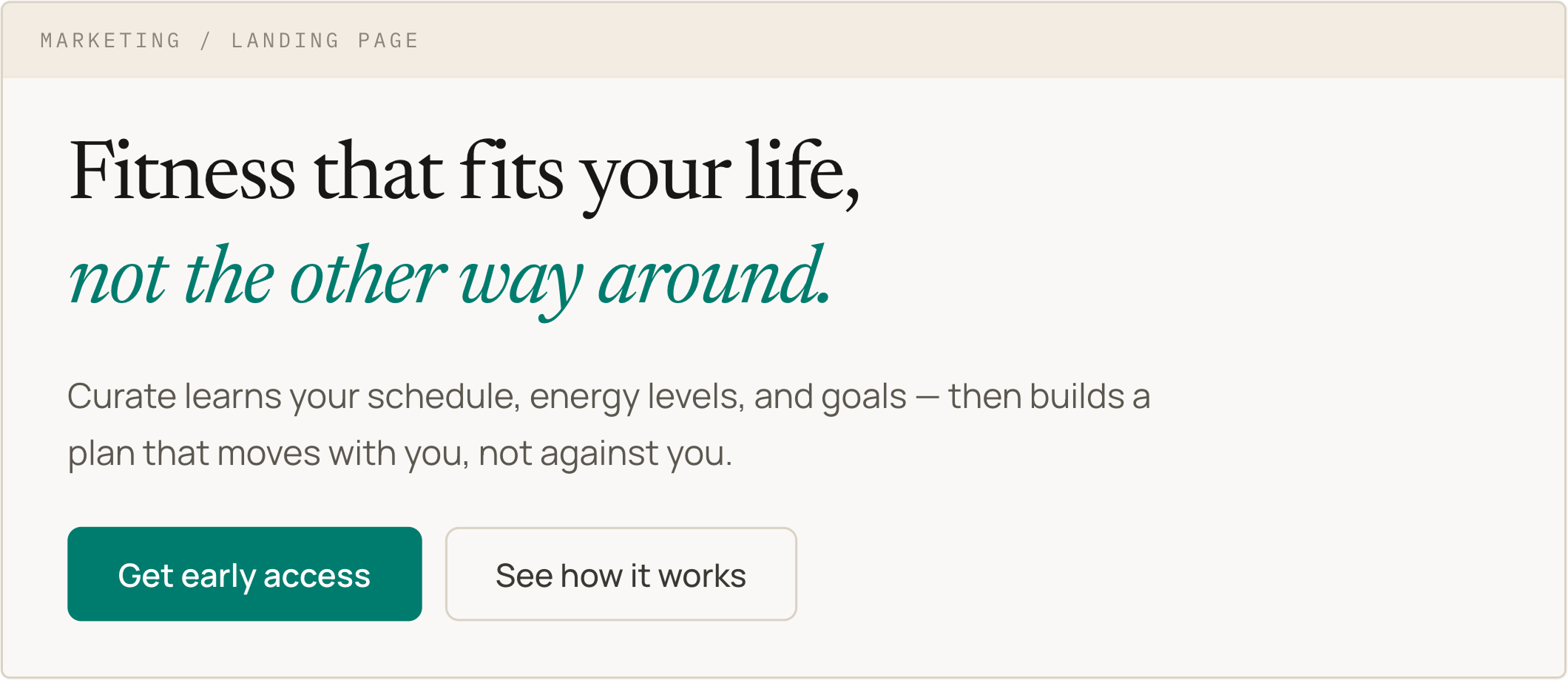
The name came from the strategy. Curate — to select, organize, and present with care on behalf of someone you know well. That's the product's relationship to the user in one word. No fitness clichés, no performance language, no implied judgment about where someone is starting from.
The full brand system was built to hold that position consistently: Teal / Coral / Indigo palette designed for warmth and WCAG 2.2 compliance across light and dark modes, a voice system with explicit guardrails against shame-driven microcopy, and a tagline that splits user ownership from AI commitment in a single line:
Move at your pace. We've got the rest.
UX + PROTOTYPE
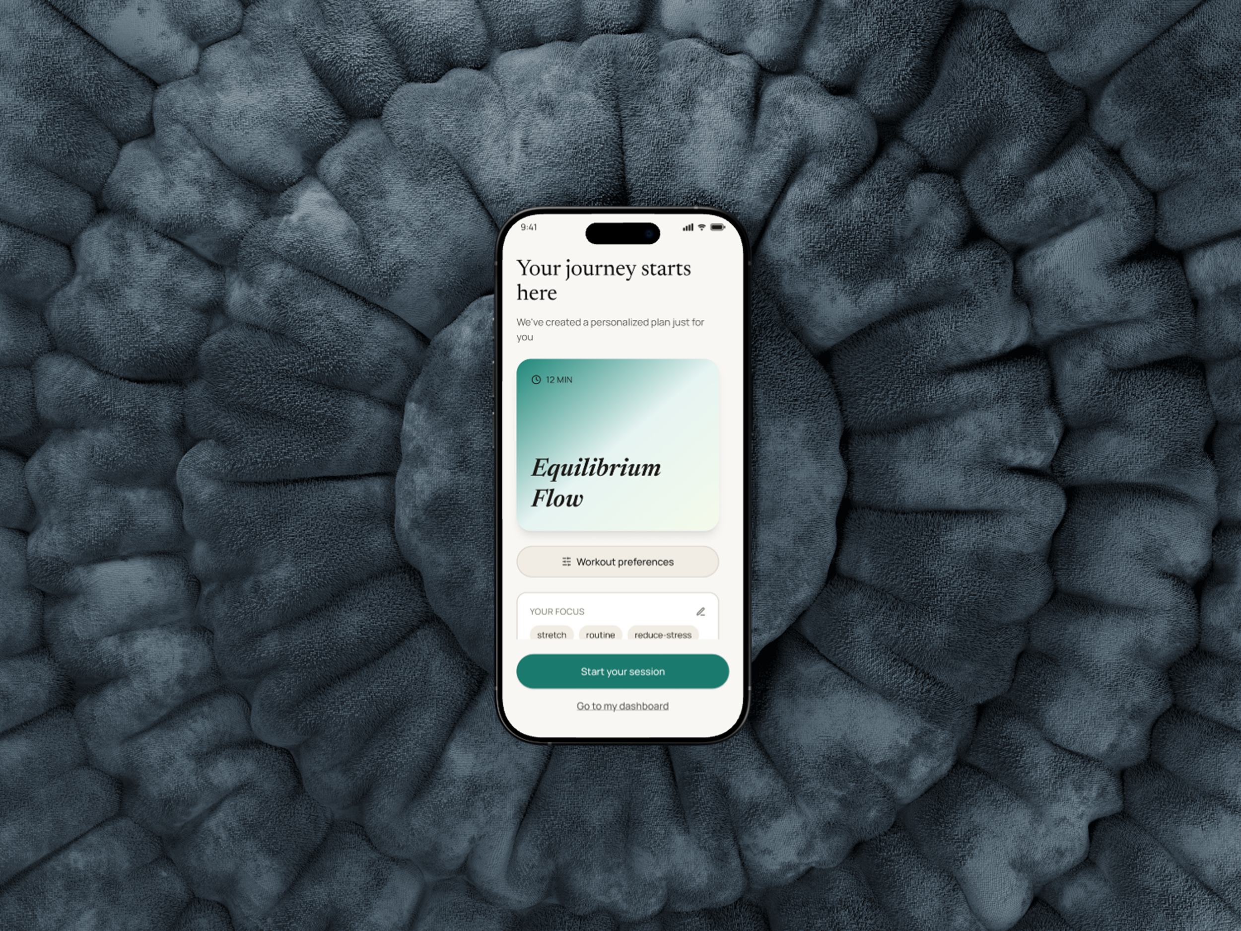
Five screens. First session in under 90 seconds.
The onboarding flow was designed around a single constraint: every question asked before the first session is a probability multiplier on abandonment. The answer was zero-decision onboarding — five screens that move from motivation framing to a body check-in to a curated first session, with the AI inferring preferences from behavior rather than asking for them upfront.
AI COLLABORATION
Embedded from day one. Every phase, a different role.
AI wasn't a tool I reached for occasionally — it was structured into the workflow from the first research session through the final brand copy pass. The role it played shifted as the project moved through phases.
Research
AI accelerated competitive synthesis and helped surface patterns across multiple sources simultaneously. The goal wasn't to outsource analysis — it was to compress the time between raw information and a testable hypothesis, so more working sessions could go toward interpretation rather than aggregation.
Strategy
AI functioned as a pressure-tester. When an opportunity was framed, the question was always: what does this miss, who does this exclude, and where is the assumption buried? That kind of structured interrogation of your own thinking is hard to do alone. Having a thinking partner that doesn't have a stake in the answer being right changes the quality of the output.
Brand
AI moved into a more collaborative role — generating naming candidates, testing voice principles against specific microcopy scenarios, and flagging when copy drifted toward the shame-driven register the product was explicitly designed to avoid. The guardrails in the brand voice document were partly built from those failure cases.
Result
An AI-augmented workflow that saved 53 hours across the project, but the most important outcome was the quality of the decisions, not the speed of making them.
Reflection
The hardest design problem wasn't the interface. It was the belief system underneath it.
While working on Curate, I realized that many fitness apps fail not because of poor execution, but because the philosophy behind them does not work for everyone. Whether through streak counters or AI coaching, many products are built on the belief that guilt, pressure, and performance targets motivate better than momentum and self-compassion. Curate challenges that assumption by lowering the cost of showing up on a hard day rather than pushing users toward an idealized standard. If you redesign the interface without questioning that philosophy, you end up with a more polished version of the same problem. That mindset also shaped my approach to accessibility. It was structural from the start, built into how personas were stress-tested and how each design decision was pressure-tested against users with the least tolerance for friction.
What I am most proud of is not just a single deliverable, but the foundation behind the brand. Curate was built on the idea that inconsistency is normal, that showing up even once still matters, and that a fitness app should help people begin again without shame.
If I had more time, I would test this shame-free progress model with real users to see whether emphasizing overall progress leads to different retention outcomes than streak-based systems. I would also complete the full app experience, including the warm AI Coach feature, so it could be tested more holistically. More than anything, Curate reflects a belief that fitness products can better support people who have felt judged, discouraged, or left behind by traditional wellness apps.