EcoHome AI
UI Case Study · Concept Project · Role: UI/ Product Designer
OVERVIEW
EcoHome AI is a sustainability-focused property discovery platform designed to help buyers evaluate homes with confidence. This was a concept project completed as part of my product development certification — representing a full end-to-end UI design process across mobile, tablet, and desktop.
Four principles shaped every decision from the start:
Sustainability ratings need plain-language context to be useful.
Buyers need faster ways to compare trade-offs without scanning full listings.
Early personalization reduces overwhelm.
Trust increases when sustainability data and property details are grouped consistently.
These weren't conclusions I arrived at — they were the foundation I designed from.
THE PROBLEM
There is a clear opportunity to bridge the gap between data availability and true understanding.
Buying a home is one of the most significant financial decisions a person will ever make. Yet buyers are routinely handed dense listings, opaque sustainability ratings, and technical jargon with no plain-language guidance on what any of it means.
Sustainability ratings are hard to interpret without context
Comparing trade-offs requires scanning multiple full listings
Buyers defer decisions without accessible, grouped data
RESEARCH + PERSONAS
I combined buyer persona insights with a review of current real estate platforms to understand where decision-making breaks down. The research consistently pointed to the same tension: buyers want to make informed, values-aligned decisions, but the tools available to them make that harder, not easier.
CORE USER FLOWS
Three flows formed the backbone of EcoHome AI — each mapped before any visual design began and refined through AI-assisted testing during the hi-fidelity stage to validate clarity and reduce friction.
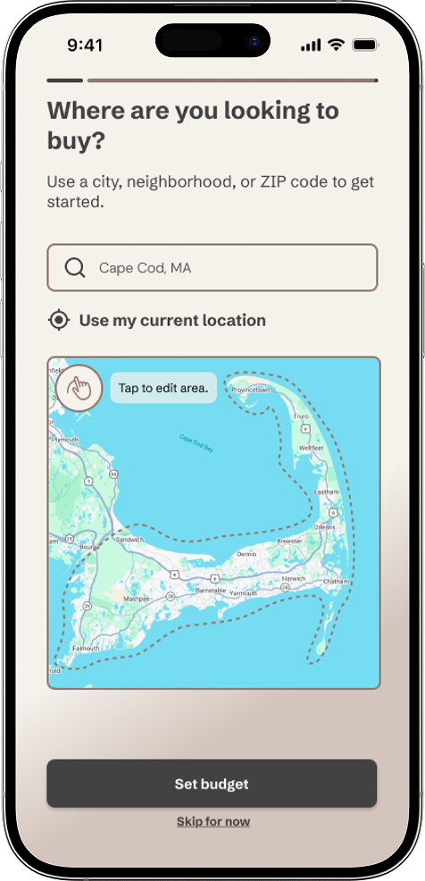
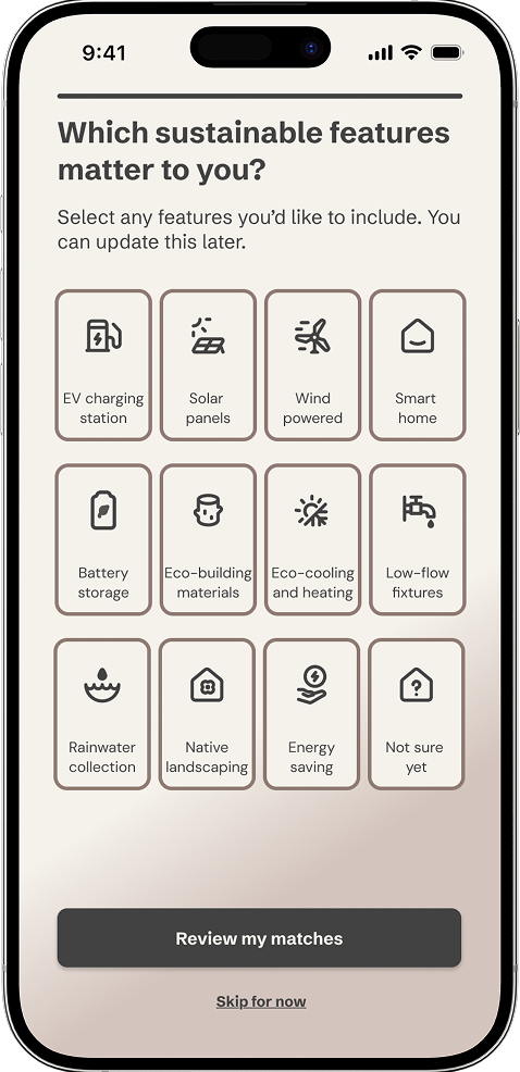
Setting Up + Adjusting Property Criteria
I streamlined how users set and refine their property criteria so they can quickly find listings that align with their needs. The flow was designed to feel flexible from the start, making it easy to adjust preferences as priorities shift throughout the search process.
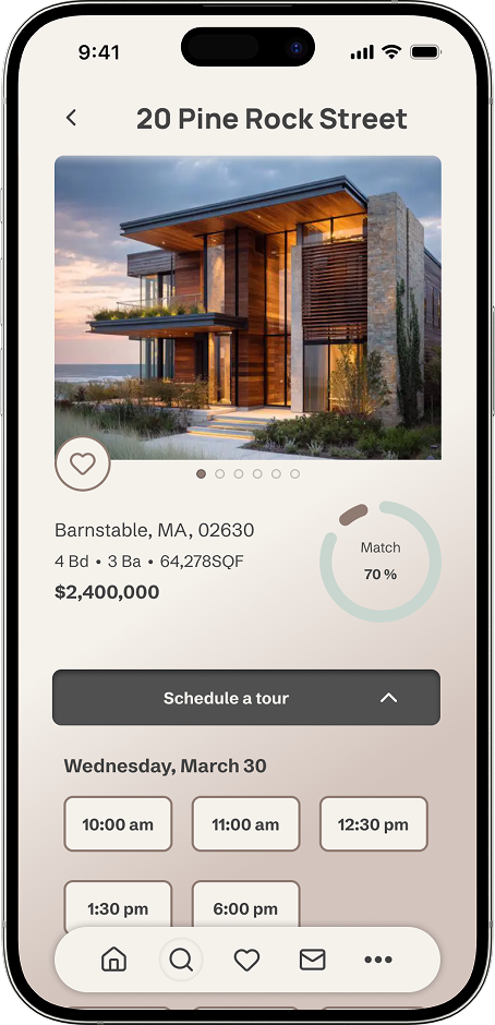
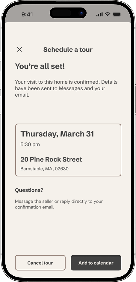
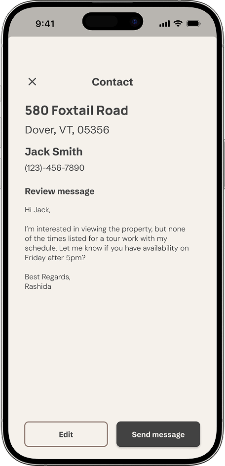
Contacting a Seller + Scheduling a Tour
I designed a clear, low-friction path for users to contact sellers and schedule tours directly from a listing. A familiar chat-based interface helps users communicate confidently without needing to learn a new interaction pattern, reducing cognitive load at a high-intent stage.
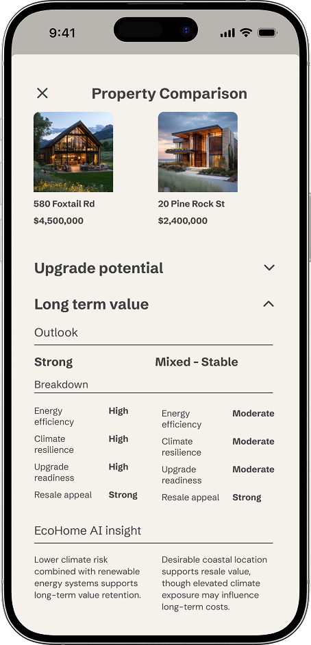
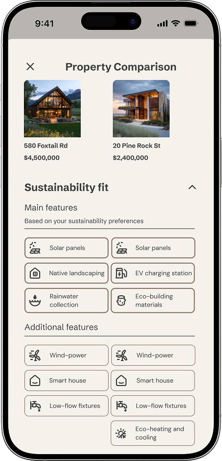
Favoriting + Comparing Properties
I focused on reducing overwhelm by creating intuitive ways for users to favorite and compare properties as they narrow their options. A familiar bottom-sheet pattern with clearly organized sections allows users to reveal information progressively, rather than processing everything at once.
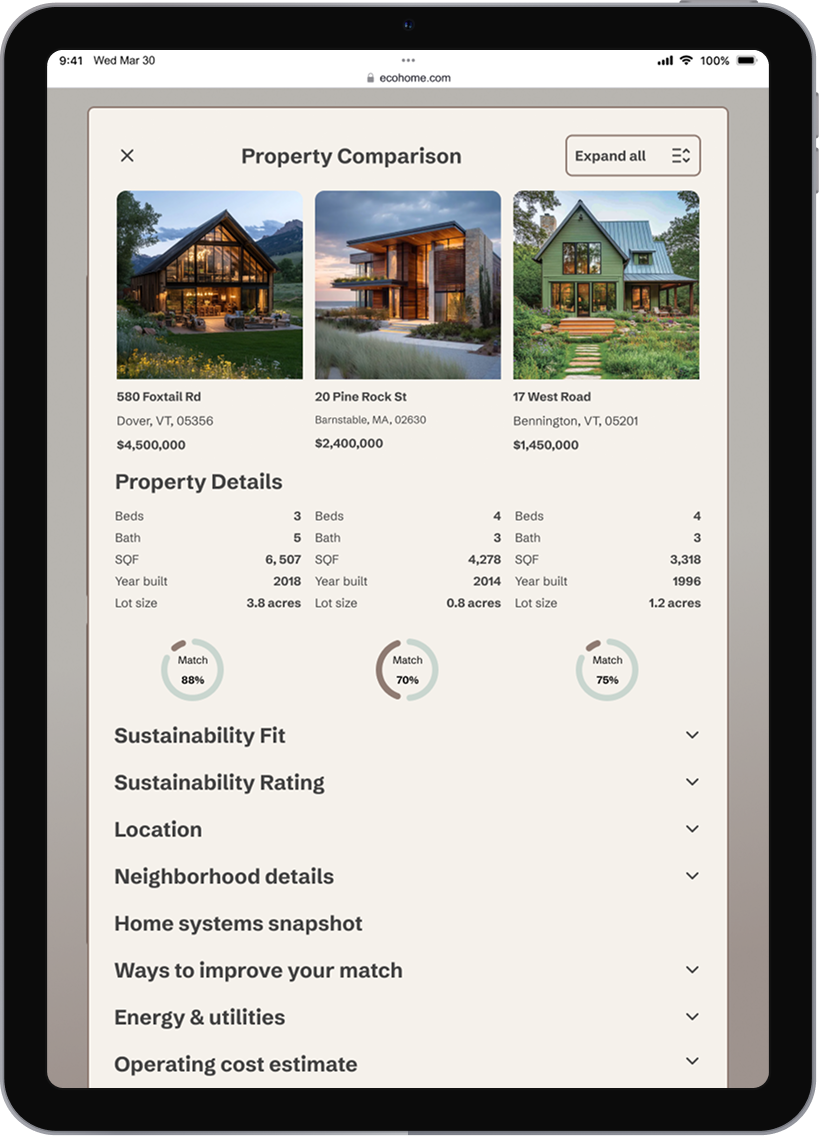
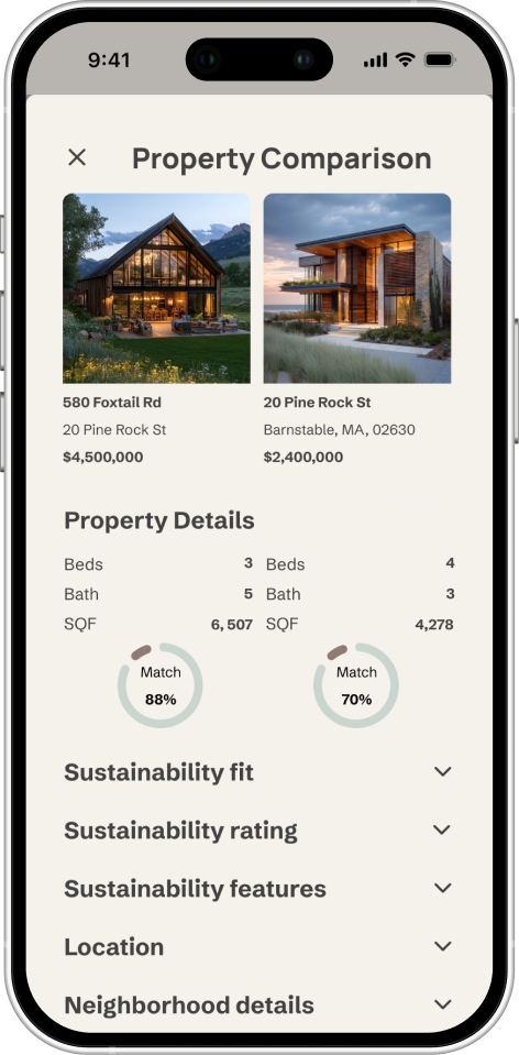
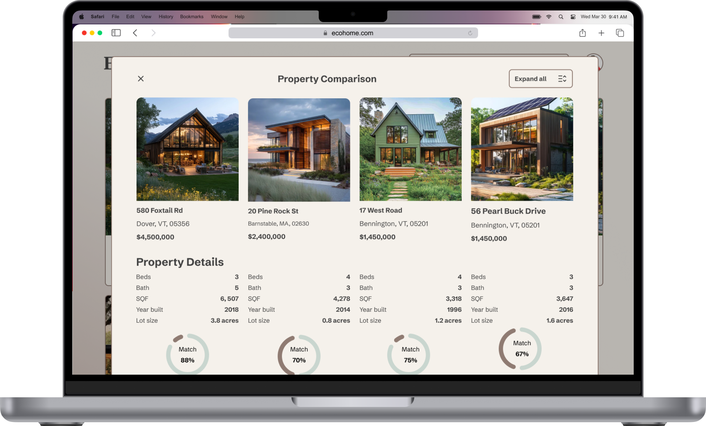
WIREFRAMES
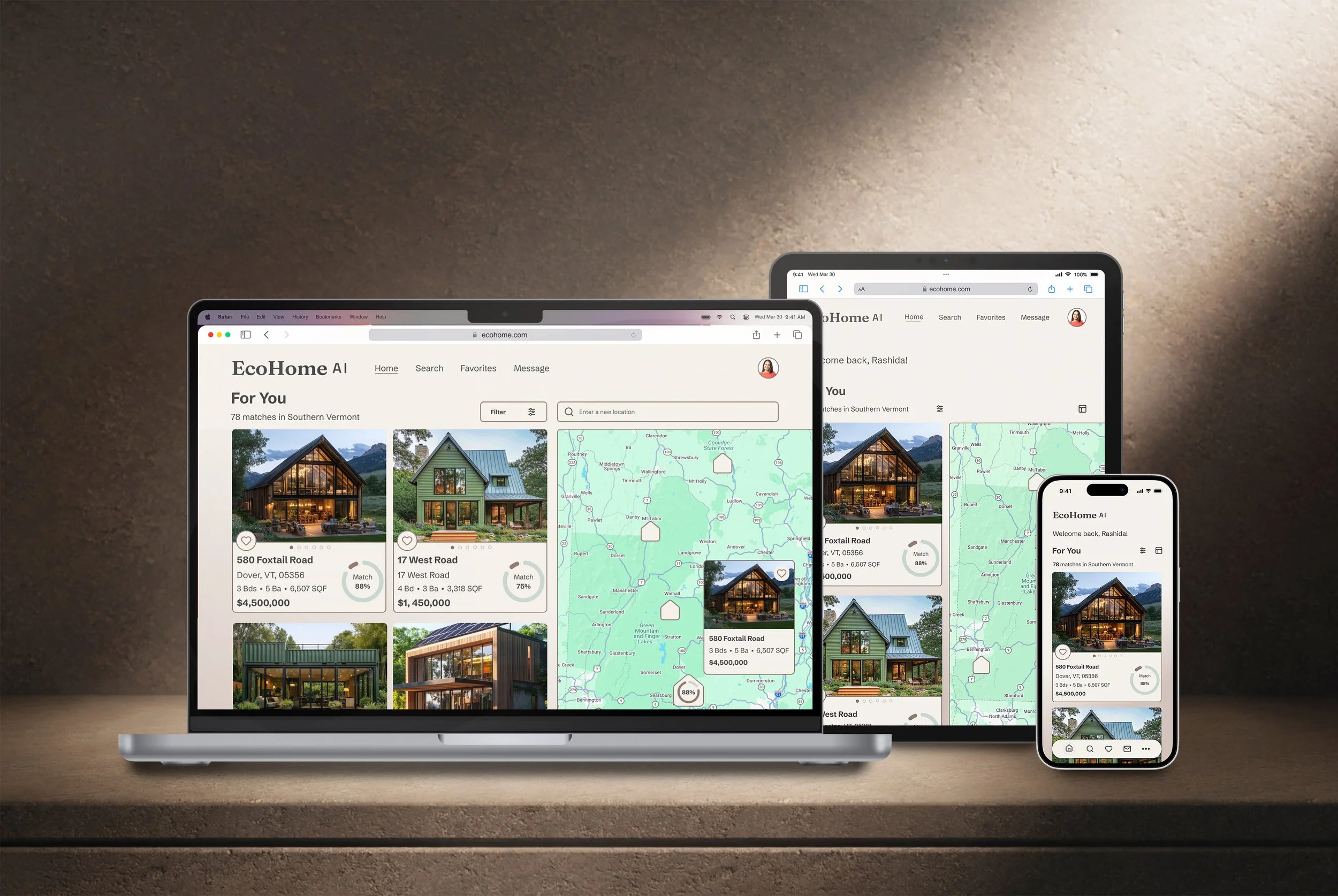
I started with pen and paper before moving into Figma, sketching the essential screens for each flow to establish structure and information hierarchy before any visual decisions were made. The three core screens — For You, Home Listing, and Property Comparison — were evolved through lo, mid, and hi-fidelity stages with one consistent priority: resolving the information architecture before applying visual polish. The mobile-first grid was established at mid-fidelity across all three breakpoints simultaneously, ensuring responsive behavior was considered structurally rather than retrofitted later.
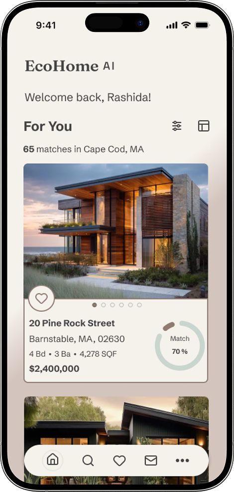
For You
The For You page establishes the product's core value proposition from the first screen — an AI-generated feed of matched properties with a visible percentage score on every card, making relevance immediately scannable.
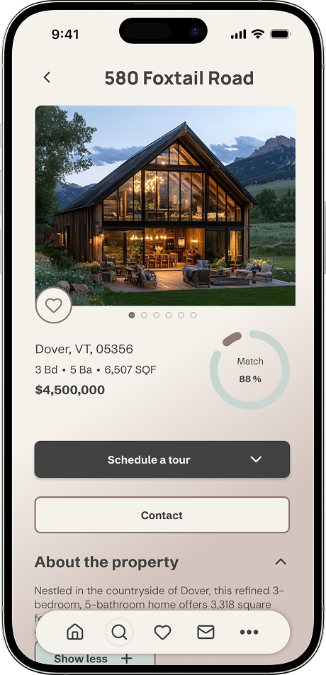
Home Listing
The listing screen was the most information-dense challenge of the project. Progressive disclosure — using accordions for sustainability data, property details, and cost estimates — kept the screen from overwhelming users while ensuring nothing important was hidden.
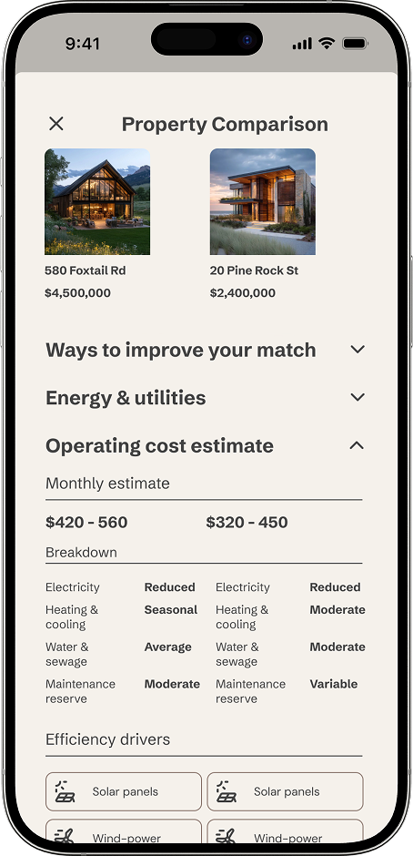
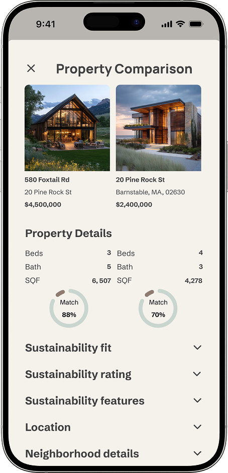
Property Comparison
The comparison screen was the most structurally complex challenge. Grouping information by dimension — rather than by property — emerged as the right decision early, allowing users to scan differences efficiently without switching between pages.
FINAL MOBILE EXPIERENCE
The final mobile screens represent the complete end-to-end experience — from onboarding and criteria setting through property discovery, listing detail, comparison, and tour scheduling. Every screen was designed to carry only what the user needs at that moment, with progressive disclosure used throughout to manage complexity without hiding important information.
Onboarding + Discovery
Home Listing + Tour + Contact
Property Comparison
EXPIERENCE ECOHOME AI
Explore the full end-to-end flow — from onboarding to property comparison — in the interactive prototype.
MOODBOARD
Before any UI decisions were made, I created a moodboard to establish the visual direction. The reference material pointed consistently toward warmth, materiality, and trust — natural textures, muted earth tones, clean typography with weight. The goal was a product that felt grounded and credible rather than tech-forward, reflecting the emotional weight of a home purchase alongside the rational one.
MOTION + INTERACTIVE ELEMENTS
Motion in EcoHome AI was used purposefully — not decoratively. Every animated interaction was designed to reduce uncertainty, confirm an action, or guide attention at a moment where clarity matters most.
Message Sent
A subtle confirmation that surfaces on successful message delivery, keeping the user in flow without interrupting their browsing experience. The animation closes automatically — signaling completion without demanding attention.

Favorite + Unfavorite
A paired interaction showing both the save and remove states — giving users clear, tactile feedback at each end of the decision. Together they demonstrate a complete interaction loop: a property is saved for consideration, then removed as the shortlist is refined.
DESIGN SYSTEM
Clarity is a design decision.
Every token, component, and pattern in this system exists to make complex data easier to understand — not easier to ignore.
Logo + Brand Icon
Typography
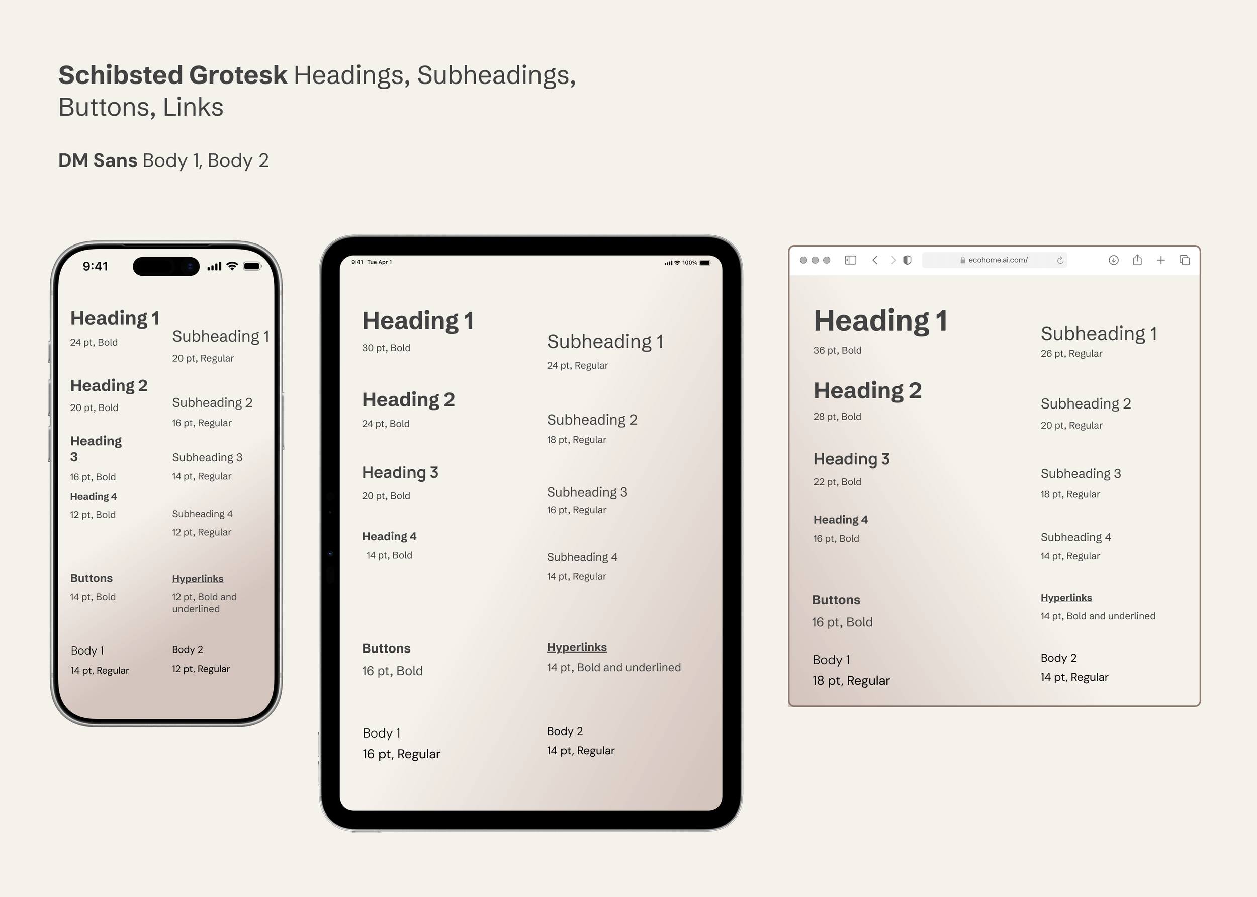
Two typefaces, one system. Schibsted Grotesk anchors headings and interactive elements with structured weight, while DM Sans keeps body text approachable and readable. The scale adapts responsively across breakpoints, preserving hierarchy without sacrificing clarity at any breakpoint.
Color
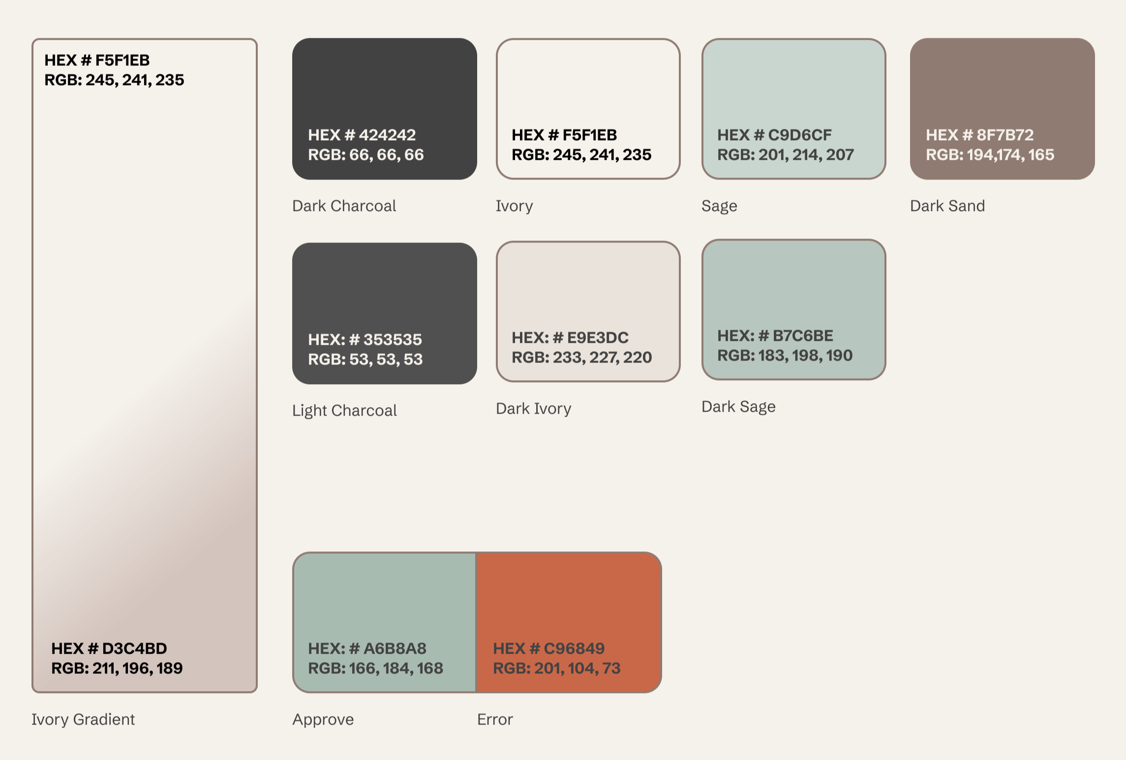
An earthy, grounded palette built for trust. Primary tokens establish the warm neutral foundation, secondary colors add depth without distraction, and system status colors communicate feedback clearly.
All text and core UI pairings meet WCAG 2.1 AA contrast standards — many exceed it.
Imagery
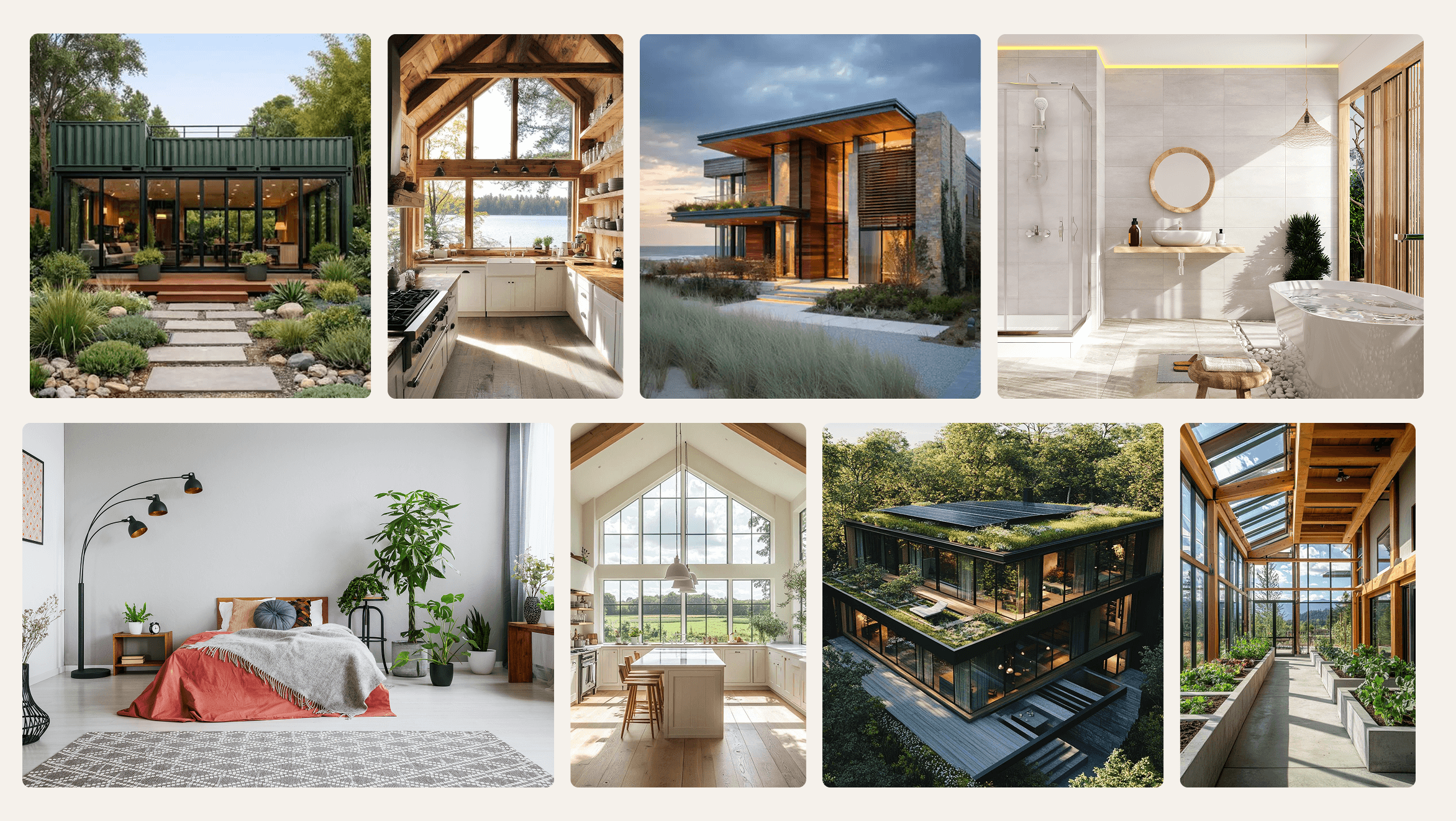
Image guidelines prioritize natural light, honest representation, and sustainability features shown in context — never staged. Every approved image is chosen to help buyers see the space clearly and feel confident in what they're evaluating.
Iconography
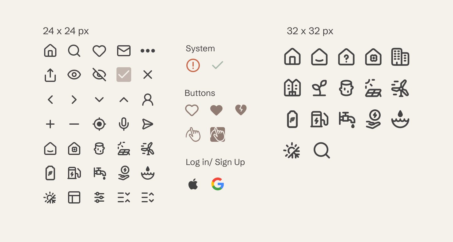
Familiar icons support quick scanning. For sustainability symbols that aren't universally recognized, every icon is paired with a clear label. This ensures users always understand what they're selecting, regardless of their prior sustainability knowledge.
UI Elements
RESPONSIVE LAYOUTS
EcoHome AI was designed mobile-first and scaled responsively across tablet and desktop. The key principle throughout was that responsive design means adapting information density — not just resizing layouts. Mobile surfaces the most essential information. Tablet introduces supporting context. Desktop unlocks the full comparison and map experience. Each breakpoint was designed as its own considered layout, not a derivative of the others.
REFLECTION
This project strengthened my ability to design complex, data-driven systems that balance visual refinement with functional depth.
The most important lesson was hierarchy before polish. When working with dense data — sustainability scores, operating cost breakdowns, long-term value assessments — the temptation is to reach for visual solutions. The more durable approach is structural. Getting the information architecture right first made every subsequent visual decision easier and more defensible.
Responsive thinking here also meant something more nuanced than resizing layouts. Mobile and desktop users approach property search differently, and designing for those behavioral differences — not just screen size differences — was what made the system feel considered rather than mechanical.
If I were to continue developing EcoHome AI, two areas would be my immediate focus. First, conducting broader usability testing with real buyers to validate the sustainability scoring system across varying levels of eco-literacy. Second, building out the full Search experience across all three breakpoints — the most structurally complex part of the product and the area with the most opportunity to differentiate from existing platforms.