Turning Housing Complexity Into Clarity
AI-powered property insights for smarter, more sustainable home decisions.
EcoHome AI is a sustainability-focused property discovery platform that helps buyers compare and evaluate homes with confidence.
It uses AI to simplify dense data — especially sustainability terminology and ratings — so users can better understand listings and focus on what matters most.
EcoHome AI’s mission is to turn dense housing data into clear, actionable guidance—supporting informed decisions from search to shortlist.
Project Overview
EcoHome AI is an end-to-end UI case study during my UI specialization course at CareerFoundry.
Role
UX/ UI Designer
ProjectType
UX/ UI Case Study
Duration
December 2025 - February 2026
Tools
Pen and Paper, Figma, Figjam, Miro, Adobe Creative Suite, ChatGPT
Responsibilities
Lead end-to-end UX and UI design across multiple breakpoints.
Develop sustainability-scoring and property-comparison frameworks.
Design onboarding flows tailored to varying levels of sustainability knowledge.
Build and maintain a scalable component and grid system.
Conduct user testing to validate clarity and reduce cognitive load.
Refine micro-interactions and feedback states for core actions.
Collaborate across critique cycles to strengthen visual hierarchy.
Establish key success criteria to guide future iterations and track impact.
Onboarding captures each buyer’s sustainability knowledge level to tailor explanations and reduce jargon-driven overwhelm.
Project Overview
EcoHome AI is a sustainability-focused property discovery platform designed to simplify how buyers evaluate homes.
The goal of this project was to design an AI-powered experience that translates complex property and sustainability data into clear, actionable insights. Rather than overwhelming users with technical ratings and jargon, EcoHome reframes property evaluation around transparency, comparison, and long-term impact.
This project focused on:
Defining the MVP for eco-conscious buyers.
Designing responsive experiences across mobile, tablet, and desktop.
Establishing a scalable sustainability scoring system
Creating a clear visual hierarchy for complex data.
The result is a streamlined product experience that helps buyers move from search to confident shortlist—without confusion.
Problem
First-time and unseasoned buyers are expected to make one of the largest financial decisions of their lives. Yet, the information provided to them is often overwhelming, inconsistent, and difficult to interpret.
Property listings often include dense specifications, unclear sustainability ratings, and limited contextual insights into long-term costs or neighborhood impacts. Without accessible explanations, buyers struggle to confidently compare options before visiting in person.
There is a clear opportunity to bridge the gap between data availability and true understanding.
Process
To design EcoHome AI, I combined buyer persona insights with a review of current real estate platforms to understand where decision-making breaks down. This work surfaced four key findings:
Sustainability ratings and terminology are difficult to interpret without plain-language context.
Buyers need faster ways to compare trade-offs without having to scan full listings.
Early personalization reduces overwhelm and irrelevant browsing.
Trust increases when sustainability, cost-to-operate, and essential property details are grouped consistently.
Using these insights, I mapped core user flows and built low-fidelity wireframes to define structure and information hierarchy. Through iterative testing and refinement, I evolved the experience into a clarity-first comparison flow—translating dense property and sustainability data into understandable, actionable guidance that supports confident evaluation.
Primary Personas
Research revealed that the core friction wasn’t a lack of interest in sustainability—it was a lack of confidence in interpreting the information.
Buyers wanted to make responsible decisions, but struggled to translate technical ratings into meaningful comparisons.
This insight informed the development of a primary persona who represents the intersection of ambition, values, and uncertainty in sustainable home buying.
Key Design Decisions
Making Sustainability Data Scannable
Since sustainability information is complex, it was organized into simple categories with visual indicators, enabling users to compare properties quickly.
Supporting Side-by-Side Comparison
With many factors to consider when purchasing a home, comparison tools were designed to help users evaluate multiple homes at once without having to navigate between separate pages.
Designing for Multiple Devices
Because users are likely to search for properties across devices, the interface was designed responsively for mobile, tablet, and desktop breakpoints.
Core User Flows
I mapped the primary buyer journeys to clarify how users move from onboarding to scheduling and confidently comparing properties.
Flow 1: Setting + Adjusting Property Criteria
Why
Setting sustainability and property preferences upfront personalizes results early while allowing flexibility as needs evolve.
Why
Let buyers schedule a tour without leaving the listing—using an in-context bottom sheet for outreach and Messages for follow-ups.
Flow 2: Scheduling a Tour
Why
Reduce decision fatigue by saving favorites and comparing properties side by side—making sustainability fit and trade-offs easy to scan.
Flow 3: Favorite + Compare Properties
Wireframes
Explored multiple layout directions to simplify dense property data and strengthen side-by-side comparison before moving into high-fidelity design.
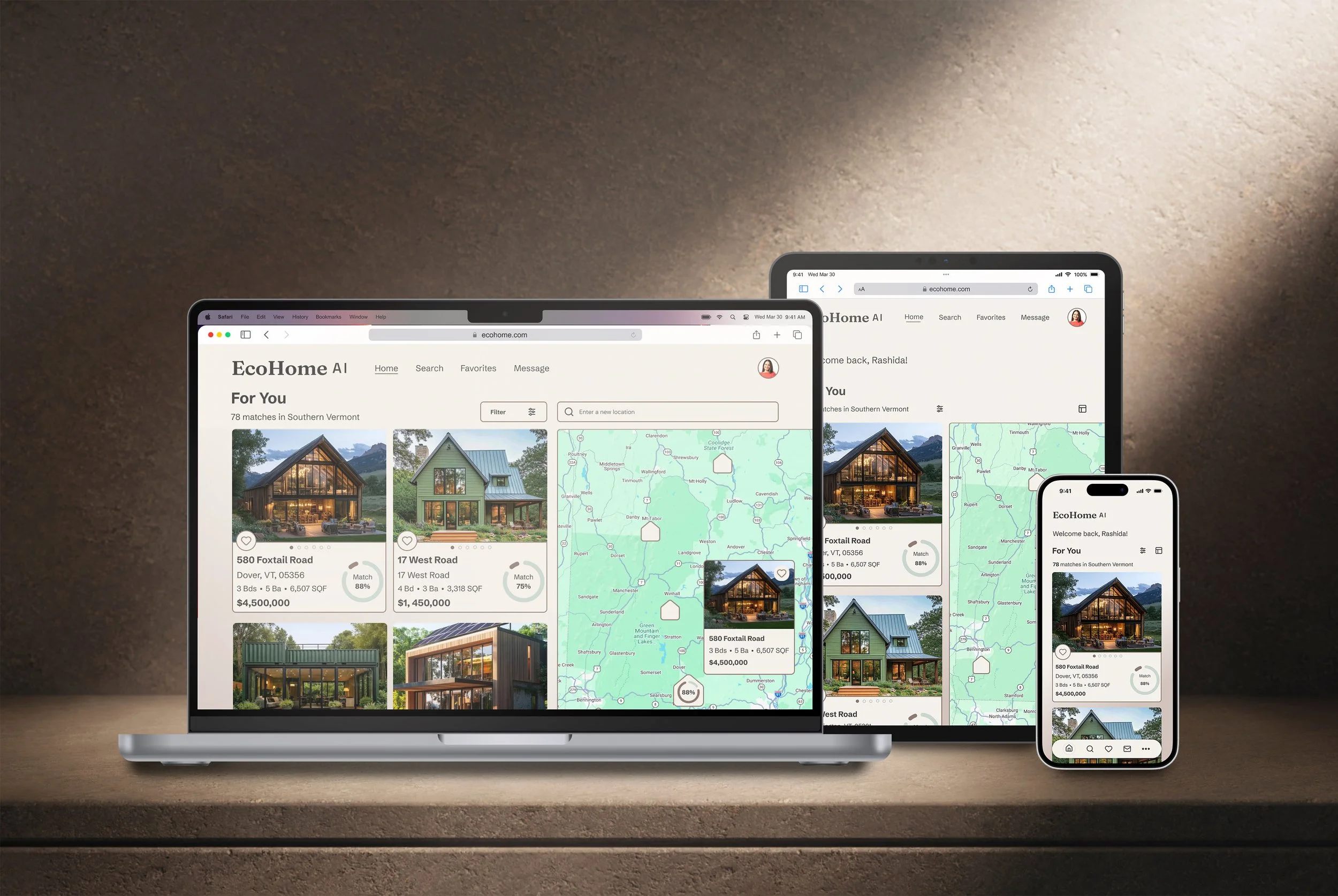
Home
Clarifying the buyer-focused MVP.
Refocused the experience around buyer priorities and clarified “For You” hierarchy.
Home Listing
Prioritizing key data and match score visibility.
Reordered listing details to highlight match score and essential property information.
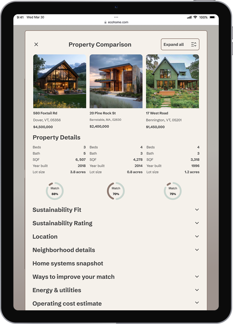
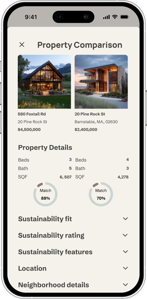
Property Compare
Structuring side-by-side evaluation.
Reorganized comparison into structured, scannable sections for faster evaluation.
Moodboard
Designed to reduce overwhelm and reinforce trust through simplicity and modern sustainability cues.
Final Mobile Experience
Designed to reduce overwhelm and reinforce trust through simplicity and modern sustainability cues.
Personalized Onboarding
Personalized Home Feed
Surfaces curated listings with visible match scores, helping buyers quickly identify properties aligned with their priorities.
Listing + Contact
Captures preferences to personalize core journeys and reduce decision friction early on.
Highlights essential property details and enables seamless outreach through an integrated bottom-sheet messaging flow.
Streamlined Tour Scheduling
Transforms interest into action with clear availability selection and confirmation—without disrupting browsing flow.
Structured Sustainability Comparison
Reorganizes dense sustainability and operating data into clear, expandable sections to support confident property evaluation.
Interaction + Motion
Motion reinforces clarity—providing feedback at key moments without distracting from decision-making.
Message Sent
Confirms successful delivery and keeps the user in flow without interrupting the browsing experience.
Motion Timing 720 ms
Auto-close 800 ms delay
Saved to Favorites
A quick confirmation that supports saving properties for later review.
Motion Timing 350 ms
Removed from Favorites
Clear feedback that the property is no longer saved, reducing uncertainty when refining saved options.
Motion Timing 700 ms
Responsive Design System
A scalable design system designed to maintain clarity, consistency, and sustainability across the product.
Logo + Brand Icon
Flexible lockups designed to adapt across screen sizes and contexts.
Color
Accessible color tokens designed for clarity in light, layered UI environments.
Accessibility
Color pairings meet WCAG 2.1 AA contrast standards for text and core UI components, with many combinations exceeding AA.
Typography
A responsive type scale that maintains hierarchy across breakpoints.
UI Elements
Standardized, breakpoint-aware components for consistent interaction patterns.
Icons
Scalable icon system optimized for 24px–32px usage across devices.
Imagery
Flexible image treatments that support layout shifts across screen sizes.
Responsive Layouts
Designed to scale clarity across devices—revealing more comparison depth as screen space increases while maintaining scannability.
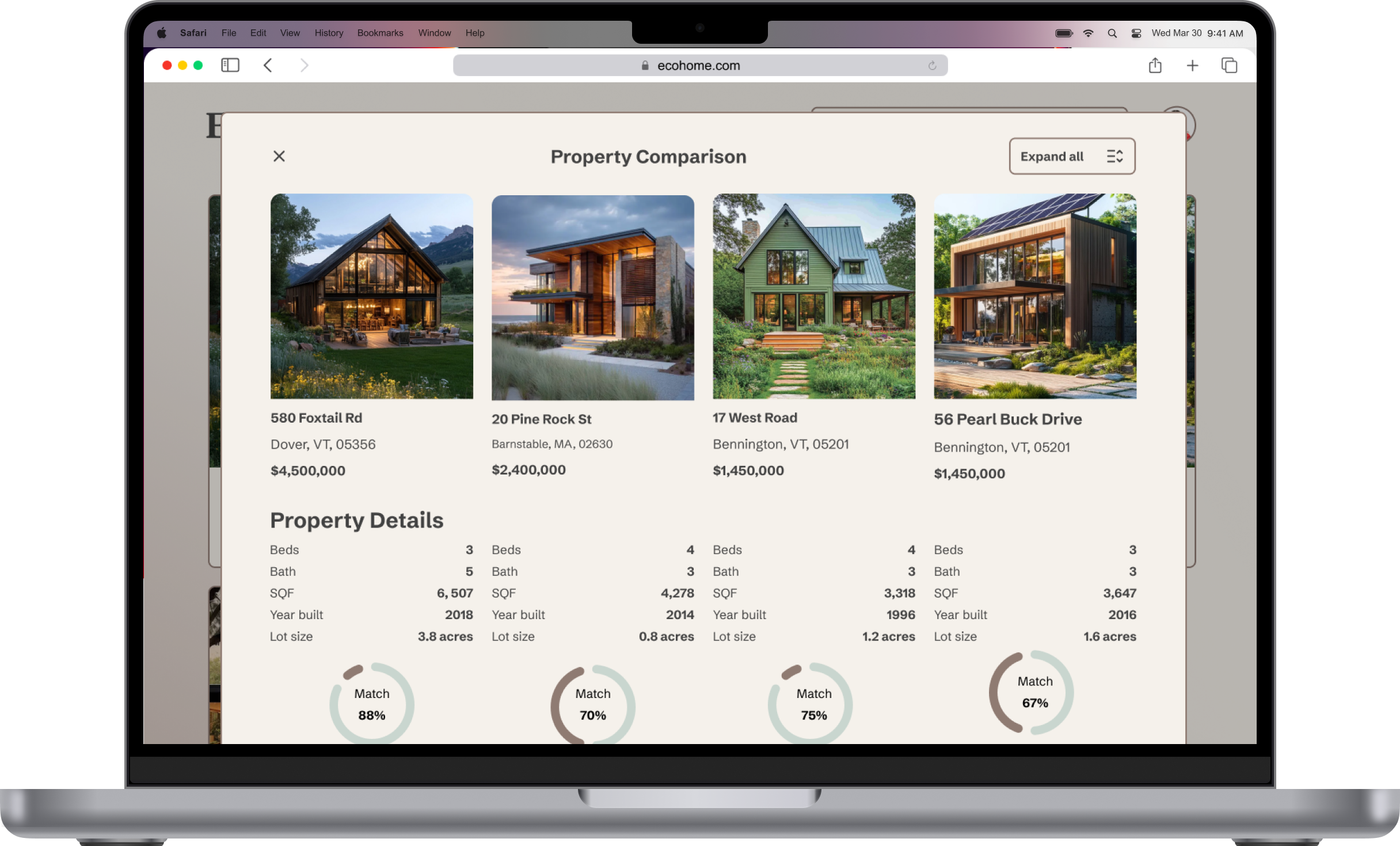
Accordion-based scanning on mobile expands into full side-by-side evaluation on desktop.
Try the Mobile Expierence
Explore key user journeys: onboarding, scheduling, and property comparison.
Next Steps
To strengthen EcoHome AI beyond the current MVP, the next iteration would focus on expanding core functionality, refining contributor workflows, and validating usability at scale.
Conduct usability testing to reduce friction
Build the Search experience across breakpoints
Refine buyer-driven listing uploads and data capture
Introduce Dark Mode for accessibility and comfort
Reintegrate the “Renovator” path with clearer positioning
These improvements would expand EcoHome AI from a clarity-first MVP into a more complete, launch-ready product ecosystem.
Outcome + Key Learnings
EcoHome AI transforms dense property and sustainability data into a clarity-first decision-making experience.
Through structured comparison, responsive layouts, and a scalable design system, the product reduces cognitive load and supports confident evaluation across devices.
Key Learnings
Designing complex data requires hierarchy before visual polish.
Responsive thinking must adapt information density, not just resize layouts.
Microinteractions reinforce trust when placed at high-intent moments
This project strengthened my ability to design complex, data-driven systems that balance visual refinement with functional depth.