
SANURO
Designing calm into every interaction.
Role: Product Designer · Type: Concept Project · Focus: Mobile App · Duration: 7 Months
OVERVIEW
A wellness app built for brains that don't fit in boxes.
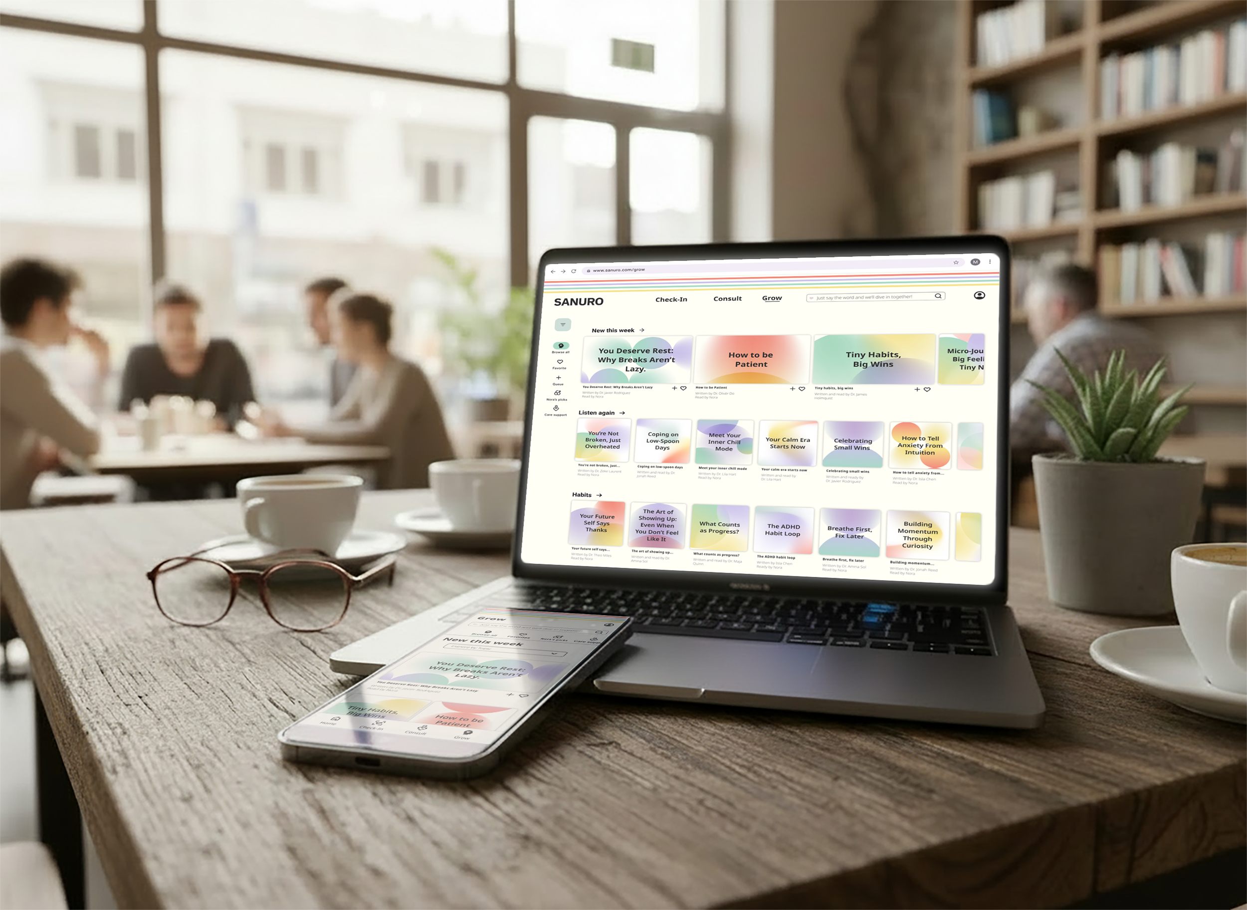
SANURO is a mobile AI-enhanced health and wellness app designed from the ground up for neurodivergent individuals — representing my full end-to-end process from research through a polished, tested prototype.
The guiding belief behind every decision: seeking help should feel safe, supportive, and uncomplicated.
ROLE + RESPONSIBILITIES
ROLE
Product Designer
DURATION
7 Months
End-to-end UX/UI · User Research · Usability Testing · Wireframing (Lo/Mid/Hi-Fi) · Design System · Information Architecture · Prototyping
RESPONSIBILITIES
BREAKPOINT
Mobile
TOOLS
Figma · FigJam · Miro · Adobe Creative Suite · Stark
THE PROBLEM
Wellness apps weren't built for everyone.
For many neurodivergent individuals, managing wellness feels like navigating a maze. Digital health tools are often fragmented, overly complex, and rigidly designed—forcing users to piece together mismatched apps that increase cognitive load rather than reduce it. Current platforms rely on high-pressure progress tracking and generic interfaces that fail to adapt to how diverse minds actually process information.
USER RESEARCH
Three people. One consistent gap.
To understand how a single product could serve meaningfully different cognitive needs without creating overwhelm, I conducted interviews with three neurodivergent individuals across distinct neurotypes, ages 18–44.
Early in synthesis, one participant said something that reframed the entire project:
"Some health apps do too much. I don't want a million options, I just want one that actually works."
It echoed across every interview. Users aren't looking for feature-dense platforms — they're looking for digital environments designed for how their minds actually operate.
Key Insights:
Cognitive Load as a Barrier: Information overload is the primary killer of consistent engagement.
Flexible Autonomy: Users reject rigid, prescriptive frameworks in favor of customizable tracking.
The Empathy Gap: Emotional safety and calm guidance are just as critical as core utility.
Immediate Value over Paywalls: Monetization transparency is a trust requirement — gating value early triggers immediate abandonment.
KEY DESIGN DECISIONS
Three principles shaped every decision in this project: giving users control over their data, communicating in plain language, and using modal and bottom sheet patterns to reduce navigation complexity. You'll see each one show up across research, wireframes, and testing.
User control as a design principle.
Research interviews revealed a consistent pattern: neurodivergent users felt monitored by health apps rather than supported and were uncertain about what data was being collected and why. I made user control the foundation of every data and privacy decision, giving users agency over how the app worked for them from the first interaction. During usability testing, participants responded that control over their data made the experience feel personally theirs, not like a generic health tool.
Plain language over clinical information.
A recurring theme from research: when apps used clinical language, users left to look up definitions — eroding trust before the app had a chance to help. I wrote all UX copy for the person using the app, not a clinician, and established clear voice guidelines for Nora so the AI maintained that standard throughout. In usability testing, participants noted the language made the app feel less like a tracking tool and more like genuine support.
Bottom sheets and modals over deep navigation
Research surfaced a consistent friction point: completing basic tasks — logging data, booking an appointment, checking personal information — required leaving the current screen and navigating through layers of menus. I used a combination of modals and bottom sheets to keep users in their current context throughout. Every usability testing participant noted they could log their mood or schedule an appointment without hesitation or backtracking.
USER PERSONAS
Who I was designing for.
USER FLOWS
Mapping the paths that matter most.
Three core tasks — logging health data, scheduling a care talk, and accessing content — each designed to feel effortless from the first tap.
Logging Health Data
Giving users multiple entry points (Home and Check-In screens), so the experience felt flexible rather than prescriptive.
Scheduling an Appointment
Kept as a subscription feature and concentrated within the Consult section to reduce navigation complexity.
Accessing Media Content
Designed with multiple pathways so users could browse however felt most natural to them.
WIREFRAMES
From rough sketch to refined experience.
Low-Fidelity
Sketching allowed me to establish structural and navigational logic before committing to any visual direction. Working at this fidelity surfaced an early pattern that carried through the entire product: modals with dropdown menus became the consistent UI approach for complex data entry — keeping interactions contained without introducing new screens.
Mid-Fidelity
Translating to digital wireframes revealed where visual hierarchy needed more rigor. I applied a 12-column mobile grid and used white space as a deliberate design tool — creating cognitive breathing room between elements in direct response to the information overload finding from research. The goal at this stage was layouts that felt considered and calm, not cluttered.
High-Fidelity
With the structural framework in place and design system established — a calming color palette, considered typography, and a full component library — the three core flows came to life. One decision at this stage defined the product's voice: renaming the "Learn" section to "Grow." The change aligned the interface with the product's core ethos, framing the experience around personal evolution rather than academic instruction.
USABILITY TESTING
What real users revealed
5
Participants
5
Issues identified
5
Issues resolved
To validate the interface, I ran usability sessions with five neurodivergent participants across remote and in-person environments, analyzing behavioral friction through an affinity map and rainbow spreadsheet to separate systemic navigation failures from minor edge cases. Every high-severity issue was resolved before moving to final prototype.
High severity
Issue 1 | AI filter hard to find
Why: All participants navigated to the Grow page, but didn't discover the AI filter in the side menu.
Fix: Moved the filter to the top of the page as a persistent, visible element.
Medium severity
Issue 2 | Expert recommendations hard to locate
Why: 4 of 5 participants went to the homepage looking for Expert Recommendations.
Fix: Added a Care Support section to the homepage below the “New This Week” section.
Medium severity
Issue 3 | "Little Wins" caused navigation confusion
Why: 3 of 5 participants tapped "Little Wins" expecting to find health tracking.
Fix: Retitled it "Milestones" and repositioned it on the homepage to better reflect its purpose.
Medium severity
Issue 4 — "My Flow" misread as scheduling
Why: 3 of 5 participants tapped "My Flow" when trying to book an appointment.
Fix: Redesigned the calendar dashboard to serve as a care hub — showing upcoming sessions, past care talks, and care recommendations in one place.
Medium severity
Issue 5 — Bottom menu contrast
Why: 3 of 5 participants found the colored icon labels hard to read.
Fix: Updated selected states to high-contrast black across all bottom menu icons.
PRODUCT DEMO
Experience SANURO
DESIGN SYSTEM
Building a cohesive visual language.
Calm is a design decision.
Every choice — from the soft color palette to the voice guidelines governing Nora — was made to help neurodivergent users feel supported, not overwhelmed.
Logo
Designed for immediate readability and recognition. The wordmark is intentionally simple — letting the interface carry the experience rather than competing with it.
Typography
Noto Sans — chosen for its clarity, neutral tone, and broad language support. Legibility was non-negotiable for an audience where cognitive load is always a consideration.
Color
Secondary colors are used exclusively as decorative and background elements. All text is rendered in Black (#2E2E2E) or Charcoal (#626262) against light surfaces to meet WCAG 2.1 AA contrast standards.
Imagery
Warm, minimal, and deliberately more playful than a typical health app. The visual direction was chosen to reinforce SANURO's personality — approachable and human.
Iconography
Three icon sizes — 24x24 for navigation, 56x56 for dashboard, 160x160 for confirmations. Each with defined default and selected states.
UI Components
A curated sample of the components users interact with throughout the experience — buttons, modals, input fields, and navigation elements built for consistency and accessibility.
NEXT STEPS
The Product Road Map
While SANURO is a concept product, the strategic thinking behind it doesn't stop at the prototype. These are the decisions I'd prioritize in the next iteration — each grounded in research, and each to be validated through continued testing with neurodivergent users.
Streamline Onboarding.
To eliminate immediate friction, I would remove the upfront subscription prompt and replace it with a guided post-sign-up walkthrough. Forcing a financial commitment before a user experiences the product contradicts the core design principle of proving value first. The walkthrough can be paused, exited, or revisited from the Account section at any time — allowing users to onboard entirely at their own pace.
Conversational Data Collection.
Rather than front-loading personal questions into a clinical, compliance-style input flow, I would eliminate the rigid hobbies form field and migrate that discovery to Nora. Allowing the AI companion to surface it organically during a user's first exchange makes data collection feel human, low-pressure, and entirely at the user's discretion.
Evolve Milestones into a Personal Hub.
Connecting “Milestones” directly to the user's profile would create a single destination for achievements, progress tracking, and account status. Beyond organization, this change would clearly differentiate the freemium and subscribed experiences — giving users a transparent view of what they have access to and what becomes available when they're ready to commit.
REFLECTION
This project taught me that good design is as much about what you remove as what you add.
Early in the process, I explored nonstandard UI elements — originally believing that the more differentiated the interface was from a traditional health app, the more neurodivergent users would respond to it. After a rigorous design critique, I recognized that the UI I created was generating cognitive overload for the exact users I was trying to support. Simplifying and standardizing those elements made the product significantly stronger.
Usability testing was the definitive anchor of this process. Observing neurodivergent users move through the flows surfaced problems that re-testing the prototype myself never would have revealed. It reinforced something I believe deeply as a foundation of product design: you cannot design for people you haven't listened to or understood.