SANURO
UX/ UI Case Study · Neuro-inclusive wellness app
Designing calm into every interaction.
Role: Product Designer · Type: Concept Project · Focus: Mobile App · Duration: 7 Months
CONCEPT
THE PROBLEM
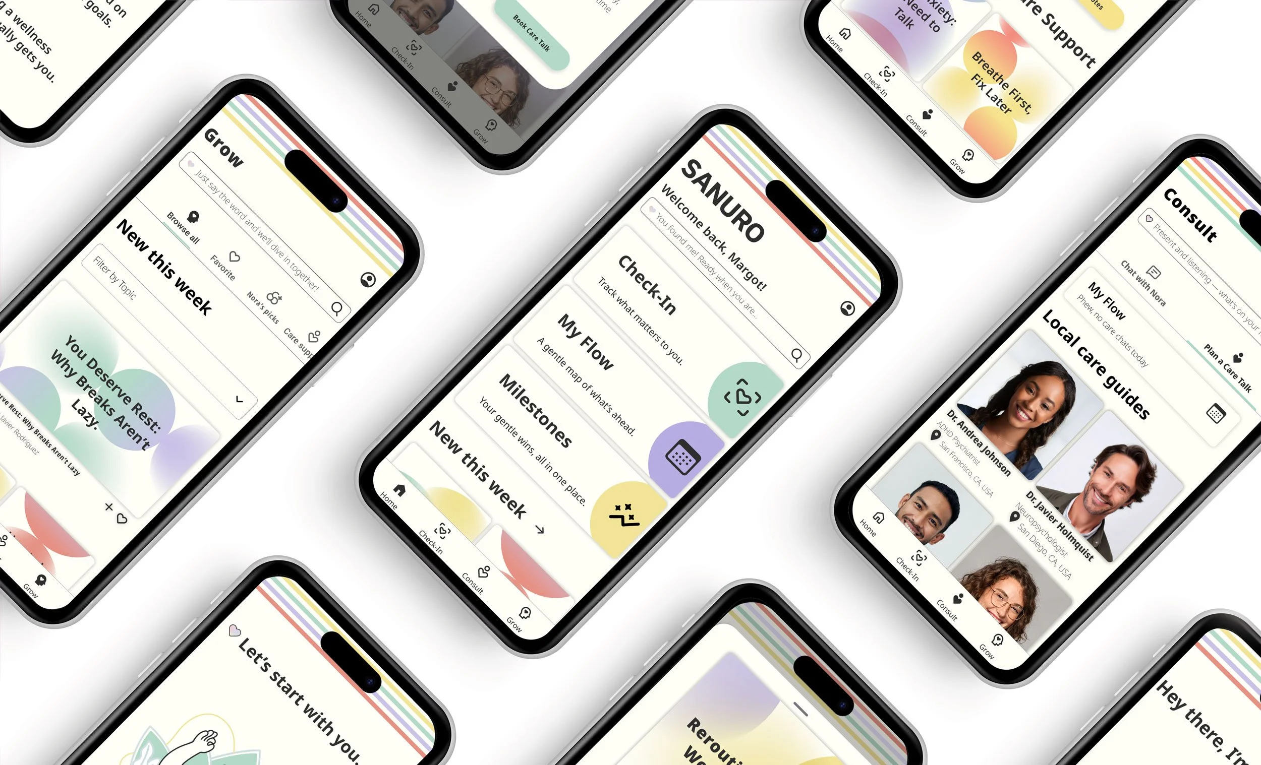
SANURO is a mobile AI-enhanced health and wellness app made for neurodivergent individuals. It’s built on the belief that getting support should always feel easy, and not like another challenge.
Neurodivergent individuals face significant cognitive friction when managing disjointed health data. They need a centralized, highly adaptive platform to track their health goals so they can feel informed, autonomous, and in control of their care.
MY APPROACH
I led the end-to-end product design lifecycle—spanning user and market research, persona development, wireframing, high-fidelity prototyping, and iterative usability testing.
Because mainstream health tools often underserve neurodivergent minds, I facilitated every interview and testing session with deliberate warmth, patience, and processing space. Taking the time to build a low-pressure environment paid off, surfacing the core insights that shaped the product ecosystem.
KEY DESIGN DECISIONS
User control as a design principle.
Plain language over clinical information.
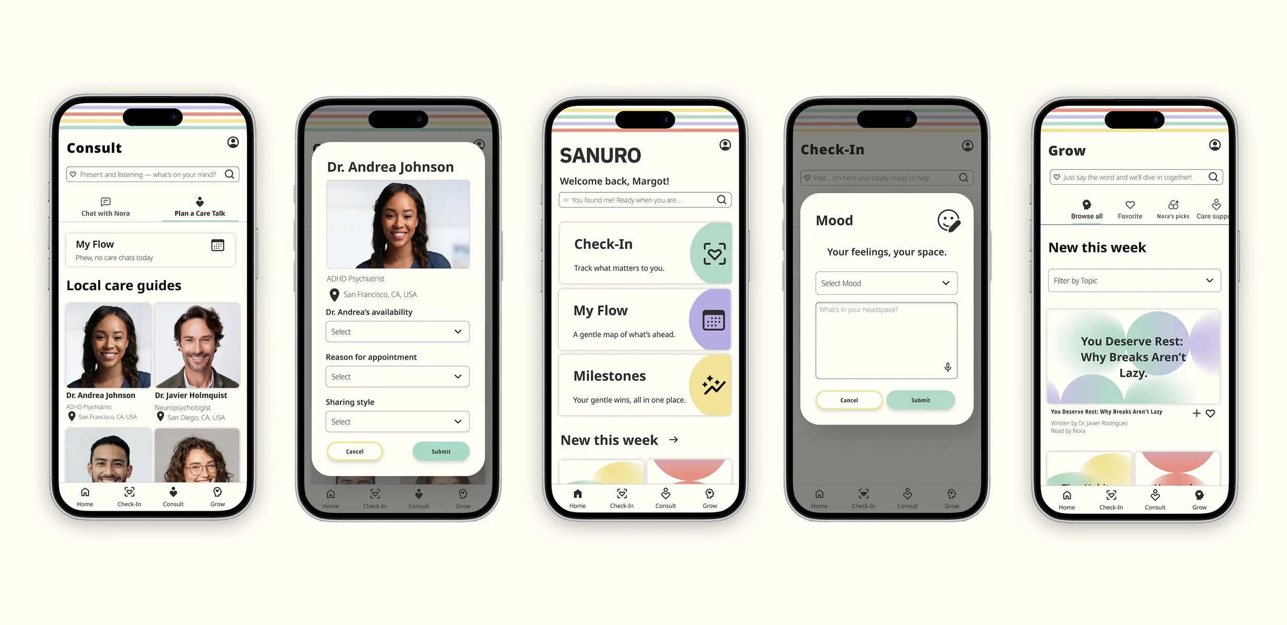
Bottom sheets and modals over deep navigation.
During research interviews, neurodivergent users shared that health apps often made them feel watched rather than supported, and they were unclear about what data was being collected and why. After hearing this, I made user control a central feature of SANURO. This way, people can decide how the app works for them. I wanted to protect their privacy and make sure the app genuinely felt like it was theirs. Participants responded immediately — many sharing that existing health apps left them with no idea where their data was going or what was being tracked.
Another recurring theme from my research is that many health apps often use clinical terms that users don't understand, so they have to look up the definitions elsewhere. When people leave the app to find out what something means, it can make them trust the app less because the information isn't clear or easy to understand. This showed me that I needed to write copy that was easy to understand and establish clear voice guidelines for the AI, so it knows what to include and what to leave out. To test this authentically, I didn't prompt participants on the copy — I let the design speak first. They volunteered it anyway, noting the language helped shift SANURO from feeling like a tracking tool to feeling like a genuine resource for support.
Another common theme from my interviews showed that many health apps hide actions. Whether you want to log health data, book a therapy appointment, or check your own information, you often have to leave your current screen to go through a maze of actions and menus to find the correct page. To minimize this friction, I decided to use a combination of modals and bottom sheets instead of traditional pages in the mobile app. The combination reduced cognitive load throughout the experience. Participants said the appointment booking flow allowed them to complete the task without hesitation or backtracking.