
EcoHome AI
UI Case Study · Sustainability Real Estate Platform
Smarter homes start with clearer data.
Role: UI + Product Designer · Type: Concept Project · Duration: 3 Months
THE PROBLEM
Buying a home is one of the most significant financial decisions a person will ever make. Yet, buyers are handed dense listings, opaque sustainability ratings, and technical jargon with no guidance on what any of it means.
MY APPROACH
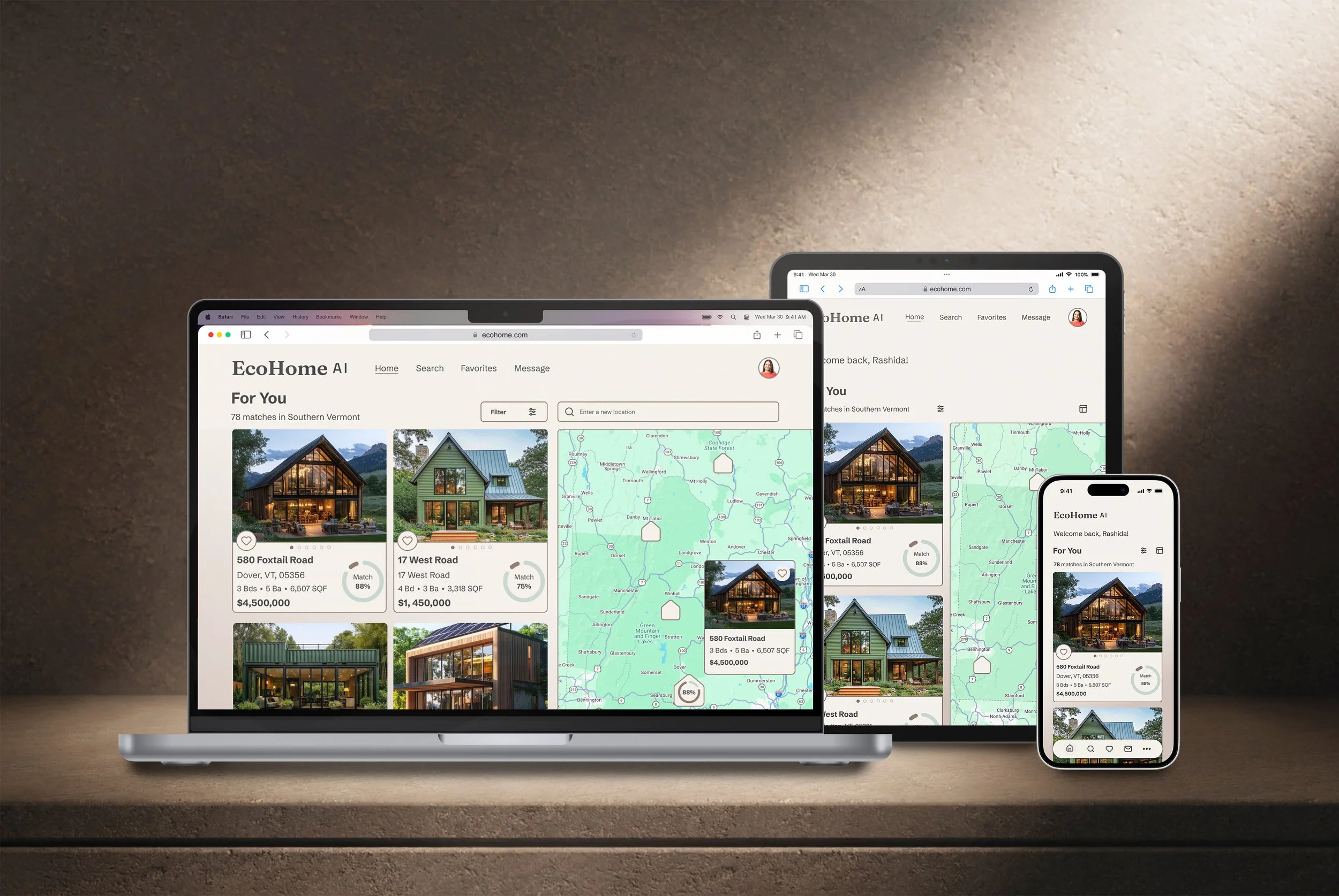
Because real estate browsing happens on the move, I designed EcoHome AI mobile-first. Starting with the smallest screen forced strict feature prioritization, ensuring a seamless, scalable experience across tablet and desktop.
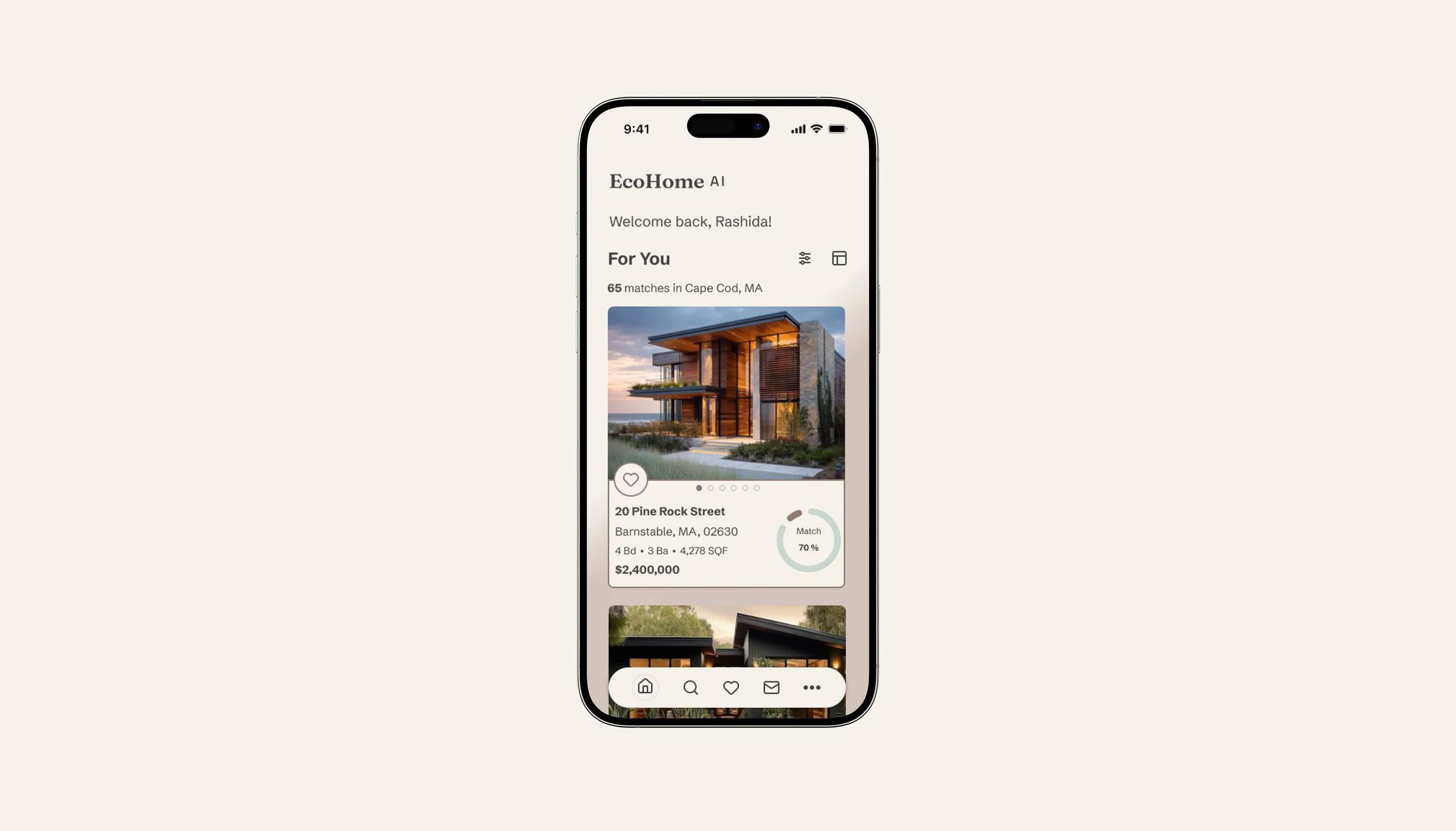
Market research revealed a common flaw in real estate apps: recognizable UI patterns undermined by buried data. To fix this, I paired familiar mental models with simplified information hierarchies — replacing dense spec sheets with clear data visualization and iconography to reduce cognitive load. The one deliberate exception? The "About the Property" section, where users explicitly want and expect granular detail.
KEY DESIGN DECISIONS
Personalization as the product, not a feature.
Onboarding built around one question at a time.
A color palette designed around listing photos.
Most real estate apps choose what you see. I built EcoHome AI to do the opposite. Users picked the features that matter most and set their own sustainability knowledge level, which allowed the app to decide what property information to share from the start. The AI match percentage only matters if users trust that it reflects their own priorities — not just what the algorithm thinks. In testing, that sense of control landed immediately. Once users understood how the match percentage mapped to their own inputs, most said they'd use it to decide which listings to open first.
Early usability testing showed that users were skipping onboarding. It wasn't that they didn't want to personalize the app — the original accordion layout showed everything at once and felt overwhelming. I redesigned the flow into six focused screens, each asking just one thing. The goal wasn't to reduce steps, but to make each step feel doable. Completion rates improved, and significantly fewer participants dropped off or tapped "Skip for now."
Skipping the expected eco-green palette wasn't just a taste call, it was a practical one. Because sellers upload their own property photos, the UI needed to stay out of the way and let the images lead. Brighter colors would have competed with listing photography on dense screens and added unnecessary visual noise. The neutral earth tones kept the interface light and let the properties take center stage. What surprised me in testing: participants described the palette as calming and said it made the property data feel more trustworthy — an association I hadn't anticipated.