Curate
UX/ UI + AI Case Study
AI fitness for the life you actually have.
Role: Product Designer · Type: Concept Project · AI-Augmented Workflow · Duration: 4 Weeks
THE PROBLEM
Fitness apps are designed to shame people into showing up. It's not working.
Streak counters, declining progress charts, and "you haven't worked out in 4 days" notifications all deliver the same message: variability is failure. 22.9% of people who download a health app stop using it — and shame-driven dropout is a documented reason why. The apps aren't failing because fitness is hard. They're failing because they were designed for an idealized user who doesn't exist — someone with consistent time, consistent energy, and no life getting in the way.
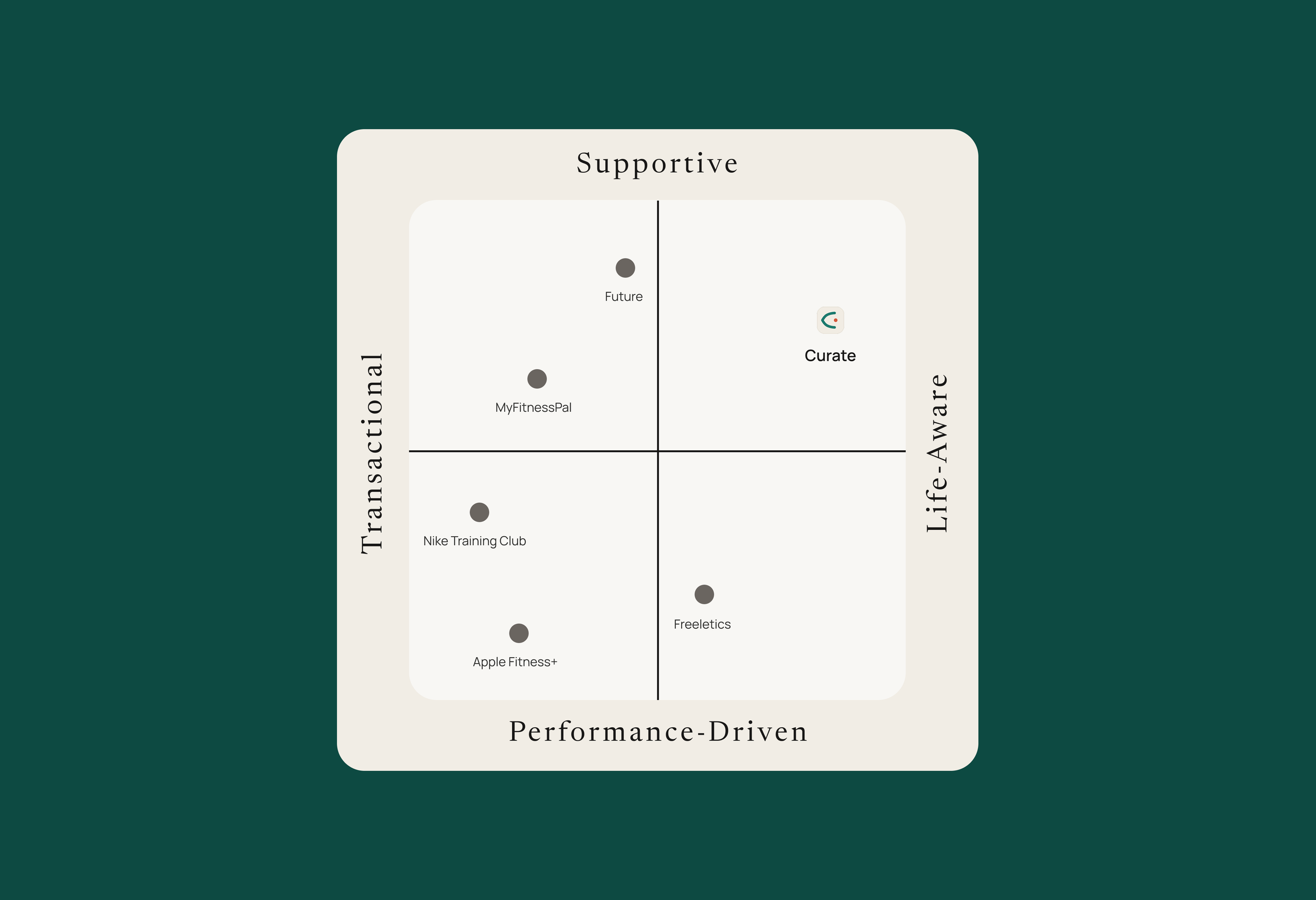
Curate was designed for everyone else.
MY APPROACH
A 4-week sprint run like a product launch.
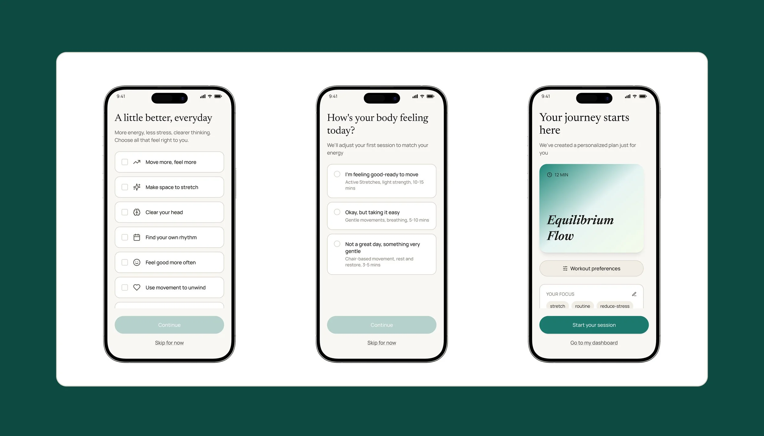
The constraint was real: four weeks to go from research to a shippable concept. That meant making deliberate scope decisions early — I deprioritized building a full app and prioritized building a complete brand identity instead. The reasoning was strategic: when investors and users evaluate a new product, they look at brand first — is there anything like this in the market, and does it feel like it belongs there? The onboarding prototype existed to make zero-decision onboarding tangible, not to simulate a finished product.
AI was embedded across every phase — but not from a single model. I worked across Claude, ChatGPT, Perplexity, and Consensus deliberately, assigning different models to different tasks and using them to verify and synthesize each other's outputs. That cross-model approach compressed research time significantly and reduced the risk of any single model's blind spots shaping the direction. The workflow evolved as the project did — this wasn't a predetermined system, it was judgment about which tool to reach for and when.
The judgment calls were mine.
KEY DESIGN DECISION
Designing for the user who already gave up once.
Most fitness apps are built for someone who just needs the right tool. Curate was designed for someone who already tried the tools — and left. That starting point changed everything.
I used edge case personas — users with the least tolerance for friction and the strongest reasons to quit — as the primary design lens. If the design worked for the hardest use case first, it would work for everyone else too. Every decision traced back to that single belief.